For 14 years, Pepsi’s iconic logo remained unchanged. However, the cola giant is now shaking things up internally with a fresh logo and revamped brand identity, which made its global debut on March 1, 2024. The new logo was initially revealed in March 2023 and was exclusively introduced in North America to coincide with the brand’s 125th anniversary.
The global launch of the new visual identity is characterized by a takeover of iconic landmarks worldwide through larger-than-life digital installations. In a coordinated effort, 120 CGI moments are being orchestrated globally, including installations at Hosier Lane in Melbourne, Australia; the mid-game colossal Pepsi can descending at Pakistan’s Gaddafi Cricket Stadium; a massive hot air assembly forming the Pepsi logo in Ho Chi Minh, Vietnam, and Warsaw, Poland. Other significant activation locations include Mumbai, India; the Nile in Egypt, and Ain Dubai.
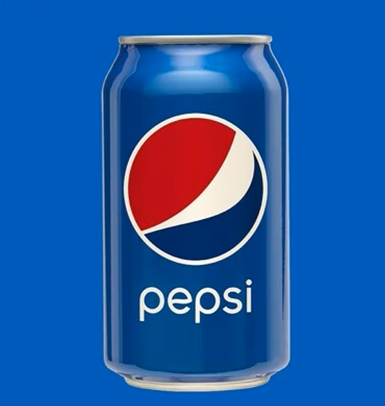
The refreshed identity draws on the brand’s 125-year history and takes cues from its logos from the 60s, 80s, and 90s. A notable update is the return of the ‘Pepsi’ wordmark to the center of the yin-yang globe, reminiscent of the design popular among children of the ’80s and ’90s. During the design process, Pepsi invited fans to draw the logo as they remembered it, with the majority including the text ‘Pepsi’ within the globe. This feedback inspired Pepsi to return to its roots.
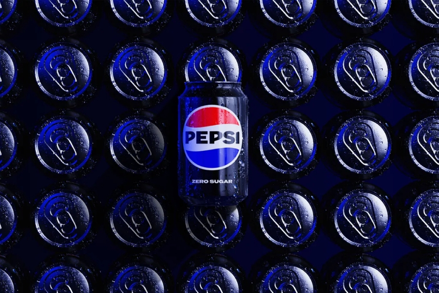
The new logo features a vibrant color palette, a white wave, and an uppercase typeface that reflects the brand’s “unapologetic mindset.” The blue shade is more electric, leaning closer to purple than midnight, while the black lettering recalls the logo of the 1960s. However, the brand refresh goes beyond nostalgia. The emphasis on black and sleekness marks a departure from traditional design and aligns more closely with Pepsi Zero Sugar, indicating a shift towards healthier choices and a more health-conscious lifestyle. This move aims to broaden Pepsi’s appeal among Gen Z consumers, a third of whom are reducing their sugar intake entirely.
The brand will also support a range of cultural moments throughout 2024 to In 2024, fans globally can expect to see more from its existing partnerships with ambassadors, including Baby Monster (Asia–Pacific), Uraz Kaygilaroglu (Turkey), G.E.M., Dylan Wang and Leo Wu (China).
Eric Melis, VP of global brand marketing for carbonated soft drinks at PepsiCo, emphasised that this visual identity shift vividly brings to life the brand’s transformation. “What better way to showcase the brand’s transformation than through these iconic installations? We’ve always been a bold brand that challenges conventions, challenges the status quo and always puts enjoyment first. Our new visual identity is bold, unapologetic, modern, and iconic. Our fans can expect the same great taste they’ve come to love with even more of the immersive and entertaining experiences we’re known for across music, sport and culture,” he said.
“We have an exciting 2024 ahead of us with our next stop bringing awe-inspiring entertainment to the UEFA Champions League Final Kick-Off Show in June in Wembley and more.” Taking a cue from this bold new look, Campaign rummaged through the archives to show the brand’s changing logos over the years since its inception in May 1863 under the name Brad’s Drink.
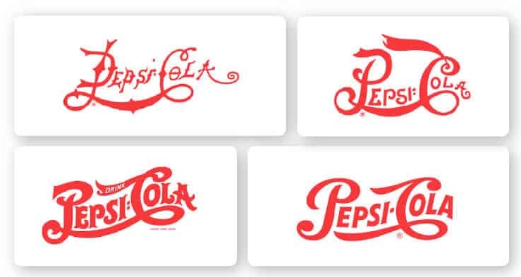
The first logo was created by Caleb D. Bradham, a pharmacist and the inventor of the formula for the first Pepsi-Cola in New Bern, North Carolina in 1898. The font was a simple script, in the classic red and white colour scheme. The style was true to beverage’s early days when Pepsi was marketed as a digestive aid, helping to relieve indigestion and other stomach ailments.

The ‘double dot’ (or the logo with a colon) is from the early 40s. A modernised tweak was rendered toward the latter part of the decade when Pepsi-Cola made its television debut. The colon gave way to a hyphen; the vintage feel and the red, blue design stayed. This was also the first time Pepsi tilted the brand conversation to focus on the beverage, talking about carbonation and emphasising its unique bubbly flavour and refreshing qualities.
The 1970s marked a turning point for the beverage giant. The brand focus shifted to popular culture and catering to a younger, fresher cohort. The ‘Globe’ logo was born and the brand name positioned in bold letters. This design was a reflection of their new direction, their cool quotient and youthful energy.
In the 1990s, Pepsi revamped its logo again, introducing the “new generation” logo. This design featured a more streamlined and modern font and a blue and silver colour scheme. Once again, it reflected the brand’s ongoing efforts to appeal to popular culture and attract a younger, more diverse audience.
Minimalist and simplistic, the 2003 logo featured a blue and silver palette and a sleek, modern font. The clarity and simplicity of the logo were meant to highlight the purity and clean taste of the soda.
At the time, the diagonally-oriented “smile” through the red and blue ball and lowercase letters was the boldest shift Pepsi had made since separating the word from the circle in 1991. The signature swish element was to signify the movement and energy of the dynamically evolving world. The latest makeover comes as a host of companies—including Domino’s, Mills, and General Mills—continue to play with retro packaging amid a surge of nostalgia from maturing Gen-Z consumers.