
Appartement 103 has created a striking, nature-led identity for Montenegro’s Oyster Gin, crafting a sculptural bottle inspired by oyster shells and Adriatic landscapes. With refined textures, sustainable materials and subtle storytelling, the design elevates the brand in the premium spirits category, celebrating authenticity, craftsmanship and the raw elegance of nature.
In the world of luxury branding, nature has long served as both muse and mirror, offering forms, textures and contrasts that evoke deep emotional resonance. From Cartier’s panther to Hermès’ horse and Fabergé’s elaborate eggs, the natural world has shaped some of the most iconic symbols of prestige. It is a relationship built on dualities—fragile yet fierce, raw yet refined, timeless yet ever-evolving—echoing the tension that defines true luxury. Now, as sustainability and authenticity become central values in the global spirits industry, this connection between nature and craftsmanship is taking on renewed significance. At the intersection of these ideals sits Oyster Gin, a premium spirit crafted in Montenegro and brought to life visually and structurally by Paris-based creative agency Appartement 103.
Oyster Gin originates from a place where rugged mountains meet the calm pulse of the Adriatic Sea, a region known for its purity, elegance and understated hedonism. Montenegro’s distinctive terroir, steeped in coastal rhythms and centuries of artisanal tradition, provided a fertile foundation for a spirit meant to embody more than flavour. The challenge for Appartement 103 was not only to reflect this Adriatic art de vivre, but to translate it into a design identity that would stand apart in the competitive global spirits landscape. Rather than merely decorating a bottle with motifs of nature, the agency set out to build a brand rooted in nature’s core principles, crafting something iconic, tactile and instantly recognisable.
The project began with one of the most symbolic forms of the natural world: the oyster. A shell that protects what is precious within, an organic icon shaped by water, time and pressure. But the agency knew that creating a literal oyster-shaped bottle risked veering into novelty. Instead, they aimed for a sculptural silhouette that captured the spirit of the oyster—its flowing contours, its layered textures, its ability to convey both vulnerability and strength—without reproducing it too literally. The result is a bottle that feels simultaneously contemporary and ancient, minimalist yet expressive, functional yet deeply artistic.
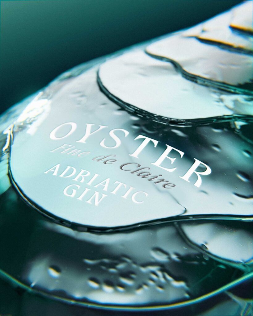
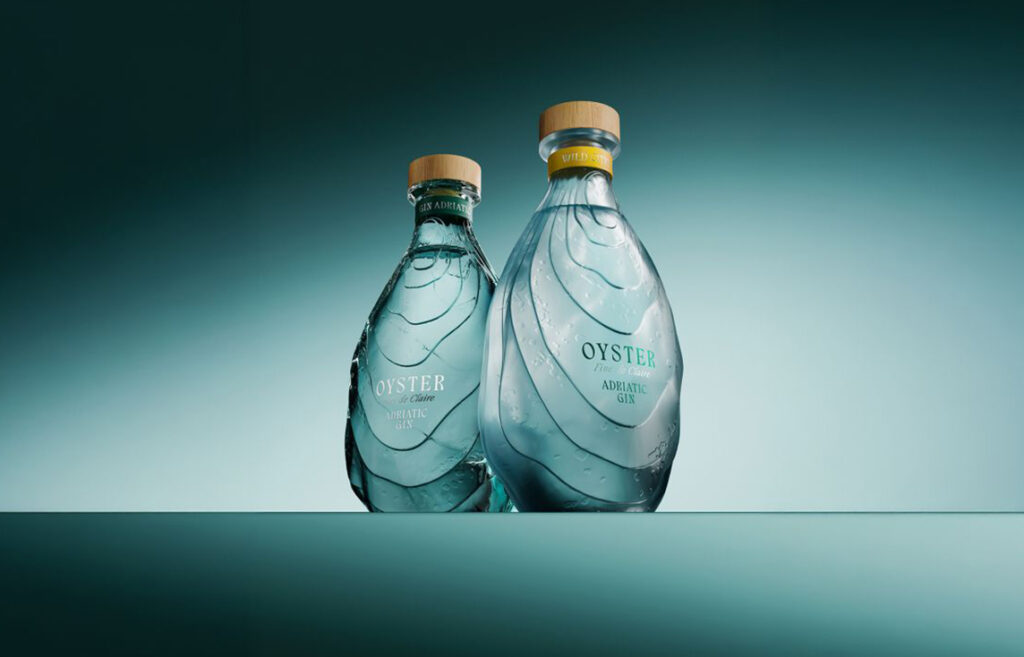
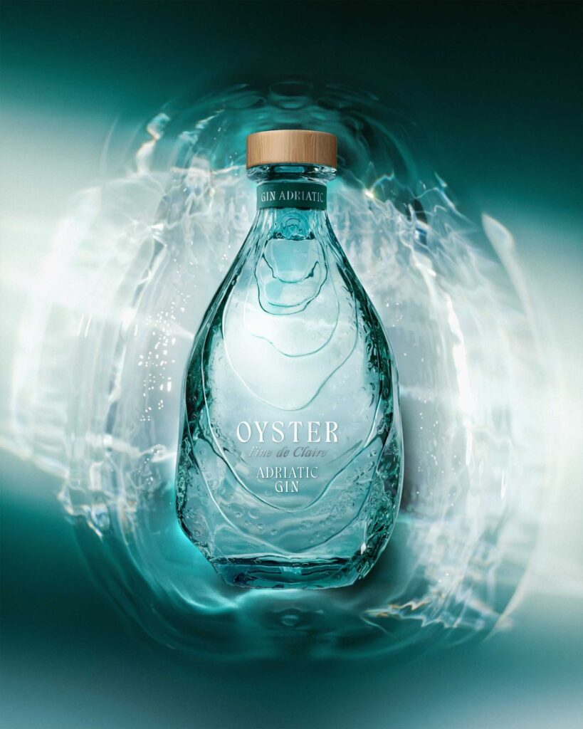
Its form features a gentle, embossed silhouette that evokes the strata of an oyster shell, subtly referencing natural irregularities through a refined design language. The glass itself carries a faint green tint, giving the bottle a soft “water echo,” as if light were passing through shallow Adriatic waters. This interplay of transparency, colour, and texture serves as a narrative device, drawing the drinker into a sensory world that extends beyond the spirit inside.
Each expression of Oyster Gin carries its own distinct finishing touches. The Adriatic Gin SKU uses clear glass infused with a subtle green hue, paired with a deep-green leather neck ring that adds a note of coastal sophistication. The Wild Citrus variant employs a frosted glass finish, creating a more tactile, earthy experience that hints at the bright, aromatic profile of the gin. Both bottles are crowned with natural wooden closures and an embossed metal coin, reinforcing the brand’s emphasis on craftsmanship and authenticity. Typography and iconography were deliberately kept quiet, allowing the bottle’s sculptural shape to command attention without distraction.
For Appartement 103, the goal was not just to design packaging, but to craft a complete brand world—visual identity, structural design, and storytelling woven seamlessly together. It meant embracing nature not as an aesthetic garnish but as a guiding philosophy, shaping every choice from materials to form to tone. In an era where technology often overshadows the organic, the agency saw an opportunity to celebrate nature as a luxury in itself, reminding consumers that true refinement often comes from simplicity and depth.
Oyster Gin’s identity also taps into the broader movement within the spirits industry toward eco-consciousness and authenticity. As more consumers seek products with meaningful origin stories and sustainable values, the role of design becomes crucial in expressing those principles. By grounding the visual language in natural forms and artisanal cues, Appartement 103 crafted an identity that aligns with these global shifts while maintaining a sense of exclusivity.
The creators behind the gin have praised the agency’s ability to translate their vision into something both iconic and emotionally resonant. “Our collaboration with Appartement 103 has been both inspiring and seamless,” said Dmitri Nasalskiy, Marketing Director of Noblewood Group. “Their talent for elevating branding while crafting a distinctive structural bottle shape has brought our vision to life in a way that feels truly iconic.”
Beyond the visual impact, the design reflects a deeper cultural relevance. As the world becomes louder, faster, and more digital, the desire for quiet luxury—objects that whisper rather than shout—continues to grow. Oyster Gin exemplifies this shift. It doesn’t rely on bright labels or ornate embellishments to make a statement. Instead, it commands presence through form, texture, and symbolism. Its sculptural bottle becomes an object of contemplation, inviting consumers to slow down and connect with the natural world that inspired it.
This philosophy aligns with a larger trend in design and branding, where storytelling and sensory richness are more effective than overt displays of extravagance. Oyster Gin’s understated identity reflects an understanding that modern luxury is not about excess, but about curating meaningful encounters—whether that’s through flavour, touch, or the emotional resonance of an object.
Appartement 103’s work on Oyster Gin demonstrates how nature, when treated with reverence rather than as ornamentation, can elevate a product into an experience. The bottle becomes more than packaging; it becomes a sculptural expression of the Adriatic landscape, a tribute to Montenegro’s raw beauty, and a reminder that luxury must still find its roots in authenticity.
In creating a brand world that balances symbolism, craft, and environmental consciousness, the agency has helped position Oyster Gin not just as a premium spirit, but as a cultural statement. It speaks quietly but confidently, encouraging a reconnection with timeless natural forms as the ultimate expression of refinement. In a marketplace overflowing with noise and novelty, Oyster Gin stands apart—an elegant reminder that nature, in its rawest form, still shapes the most enduring icons of luxury.
Discover more from Creative Brands
Subscribe to get the latest posts sent to your email.


