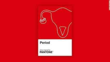
Pantone launches new shade of red to stave off universal stigma surrounding menstruation. Naming it ‘Period’, Pantone, a company that develops swatches, has unveiled the colour in partnership with Swedish menstrual care brand Intimina.

Pantone has launched the colour as part of its new campaign called ‘Seen + Heard’, seeking to “make menstruation more visible and normalise this most normal of bodily functions”. Menstruation has for centuries been layered over by culturally normative and inhibitive attitudes.
The Pantone System of swatches was first launched in 1963 in the US as a solution to the problem of accurate colour matching in the print industry. “In 1963, Pantone revolutionized the printing industry with the colourful PANTONE MATCHING SYSTEM®, an innovative tool allowing for the faithful selection, articulation and reproduction of consistent, accurate colour anywhere in the world. The tool organizes colour standards through a proprietary numbering system and chip format, which have since become iconic to the Pantone brand,” says the company on its website.
As of 2020, its swatch book has more than 2,600 colours. Pantone has earlier worked with Tiffany & Co’s 1897 Blue, Coca-Cola’s Coke Red, and Starbucks’ Starbucks Green.

‘Period’, which is a deep shape of red, has been inspired by the idea of a “steady menstrual flow”, says Pantone Color Institute Vice-President Laurie Pressman. In a press statement given to Design Week, Pressman says Pantone and Intimina worked together with a gynaecologist and “consulted research published in Medical News Today” to build the shade.
Pressman, however, cautions that while the company conferred with experts, the colour is not meant to be an “accurate depiction” of menstrual blood, which can range from darker black to orange and pink. “Instead, we created a visual identifier of a red shade that would help Intimina leverage the power of colour to share their story,” she says.
With ‘Period’, Pantone and Intimina are seeking to be part of a movement to do away with the culturally intrinsic stigma around period around the world.
Intimina says the Seen + Heard campaign will focus on how people across genders can talk about menstruation freely and without any inhibition. The campaign will be backed up by the use of Pantone’s Period.
In the note, Pantone says it hopes the use of the colour ‘Period’ will “embolden people who menstruate to feel proud of who they are”.
Discover more from Creative Brands
Subscribe to get the latest posts sent to your email.


