
Zingara, a new beverage brand by Noramble, channels retro flavours and nostalgic cues into a bold, contemporary identity. With vibrant colours, expressive typography, and flavour mascots, the brand transforms throwback charm into a distinctive, shelf-ready system built for storytelling, recall, and long-term equity in a crowded market.
In a beverage aisle crowded with claims of refreshment, wellness, and energy, standing out often demands more than a new flavour. It requires a story, a mood, and a memory. That is precisely the space where Zingara finds its footing. Conceived and crafted by Noramble, Zingara is a drink brand that draws deeply from retro flavours and nostalgic cues, yet presents itself with a visual confidence that feels unmistakably current.
The challenge at hand was not simply to design packaging for another beverage entrant. It was to translate the intangible warmth of “throwback spirit” into a cohesive brand and packaging system that could compete for attention in a modern retail environment. Nostalgia, after all, can easily slip into cliché. The task was to capture its emotional richness without allowing it to look dated or derivative.
Zingara’s identity achieves this balance by blending bold typography with a vibrant colour palette that immediately commands attention. The visual language does not whisper memories of the past; it celebrates them with exuberance. Yet, it does so through a distinctly contemporary lens, ensuring the brand feels relevant to today’s consumer rather than trapped in yesterday’s aesthetic.
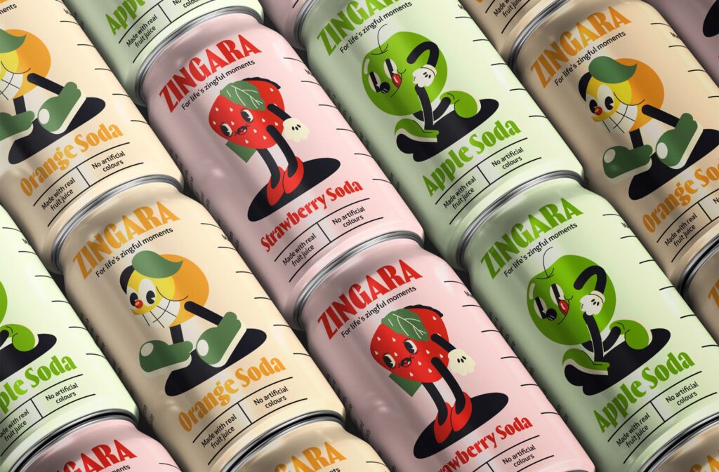
At the heart of the system lies a clever storytelling device: flavour mascots. Each flavour is personified through a character that embodies its personality, mood, and sensory appeal. These mascots do more than decorate the packaging; they become narrative anchors for the brand. They invite consumers into a playful universe where each bottle or can feels like meeting a familiar friend with a distinct persona.
This character-driven approach serves multiple purposes. On the shelf, it creates instant differentiation. Where many beverage labels rely on photography or minimalist cues, Zingara’s mascots create a lively, almost animated presence that is difficult to ignore. Beyond the shelf, they offer a foundation for long-term storytelling across campaigns, merchandise, digital interactions, and future product extensions.
Typography plays an equally critical role in shaping the brand’s voice. The letterforms are bold, expressive, and unapologetically loud, echoing the exuberance of retro signage and pop culture references. Yet the execution is crisp and controlled, avoiding the clutter often associated with vintage-inspired design. This careful calibration allows the brand to evoke nostalgia without sacrificing clarity or sophistication.
Colour, too, is deployed with intent. The palette is vibrant, joyful, and high-contrast, reminiscent of classic drink labels and confectionery packaging from decades past. However, the combinations and applications feel fresh and dynamic, aligning with modern visual preferences. The result is packaging that pops on the shelf while still feeling thoughtfully designed.
The success of Zingara’s identity lies in how seamlessly these elements come together into a unified system. The mascots, typography, and colour are not standalone embellishments; they are interdependent components of a visual language that can scale across formats and touchpoints. This scalability ensures the brand is not just eye-catching at launch but equipped for sustained growth.
In a market where new beverage brands often lean heavily into functional claims or health-forward positioning, Zingara takes a different route. It sells a feeling. It invites consumers to reconnect with simpler pleasures, familiar tastes, and moments of joy associated with childhood treats and shared experiences. This emotional positioning gives the brand a distinct edge in a category often dominated by rational messaging.
For Noramble, the project represented an opportunity to explore how nostalgia can be reinterpreted for contemporary audiences. Rather than replicating retro aesthetics, the design reframes them. It asks what made those visual cues memorable in the first place and then rebuilds them with modern sensibilities. The outcome is a brand that feels rooted in memory but built for today.
The packaging system’s strength is particularly evident in how it performs at retail. From a distance, the bold colours and mascots draw the eye. Up close, the typography and details reward attention, creating a layered experience for the consumer. This dual impact—immediate attraction followed by deeper engagement—is critical in crowded retail environments where attention spans are short.
Beyond the physical shelf, Zingara’s visual identity is primed for digital life. The mascots lend themselves naturally to social media storytelling, animated content, and interactive experiences. The bold design translates well to screens, ensuring the brand remains consistent and compelling across platforms.
Ultimately, Zingara demonstrates how a strong brand identity can elevate a product beyond its category constraints. By rooting itself in nostalgia while expressing itself through modern design, the brand achieves a rare balance: it feels both familiar and new. It does not merely compete for space in the beverage aisle; it claims a distinct personality within it.
In doing so, Zingara sets a precedent for how emerging drink brands can differentiate themselves—not through louder claims, but through richer storytelling and sharper design thinking. It is a reminder that sometimes, the most effective way to move forward is to revisit the feelings that once made us smile and present them in a form that resonates today.
Discover more from Creative Brands
Subscribe to get the latest posts sent to your email.


