
TEHUL, a wine packaging project by Nano Alfonsin Studio, translates Mendoza’s layered soils and Huarpe heritage into tactile design. Rooted in the concept of depth, it avoids decorative excess, instead using materiality, texture, and restrained graphics to evoke geological and cultural layers, offering a contemporary expression of place.
In Mendoza, Argentina, wine is more than a product—it is a story of land, culture, and memory. TEHUL, a wine packaging project conceived by Nano Alfonsin Studio, seeks to capture that story not through ornate graphics or overt symbolism, but through a tactile, layered design that mirrors the very soil from which the vines grow. The project is rooted in the belief that identity is built in layers, and its execution reflects a holistic approach where concept, materiality, form, and surface converge to express origin.
The name TEHUL, drawn from the Huarpe language, anchors the project in both geography and heritage. Meaning “depth” or “what lies beneath,” it encapsulates the dual inspiration behind the design: the stratified soils of Mendoza and the cultural legacy of the Huarpe people, the original inhabitants of the region. This choice is not ornamental but conceptual, a reminder that the land carries both physical and cultural strata accumulated over generations. TEHUL is thus not just packaging—it is a vessel of memory, a translation of territory into design.
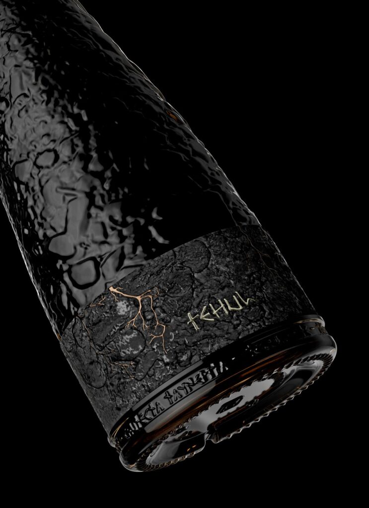
Nano Alfonsin Studio’s approach avoids the pitfalls of folkloric decoration or literal storytelling. Instead, it embraces subtlety and restraint. The packaging translates geological depth into a tactile language, with surfaces that evoke soil cross-sections, sediments, and mineral traces. These layers are not illustrated but unearthed, creating a sense of verticality and time embedded in the material itself. The result is packaging that feels discovered rather than designed, as if it has emerged from the land rather than been imposed upon it.
This tactile sensibility is central to TEHUL’s philosophy. Identity, the project suggests, is not something shouted through excess but whispered through proximity and touch. Typography and graphic elements are deliberately restrained, serving as structural anchors rather than focal points. By allowing material choices and textures to carry the emotional weight, the design reinforces the idea that place is experienced through contact, through the quiet recognition of depth rather than the loud assertion of surface.
The soils of Mendoza, famed for their role in shaping the character of its wines, become here a metaphor for cultural identity. Just as layers of clay, sand, and stone influence the flavour and structure of a vintage, so too do layers of history, memory, and tradition shape the identity of a community. TEHUL’s design acknowledges this parallel, embedding geological and cultural references into its surfaces without resorting to literal imagery. It is a design that respects the land and its people, offering a contemporary expression that is both rooted and forward-looking.
The Huarpe legacy is particularly significant in this narrative. As the original inhabitants of Mendoza, their presence is often overlooked in mainstream cultural expressions. TEHUL honours them not by appropriating motifs or symbols, but by integrating their concept of depth into the very foundation of the project. In doing so, it positions design as a form of cultural respect, a way of acknowledging heritage without reducing it to decoration. This quiet reverence distinguishes TEHUL from more superficial branding exercises, aligning it with a broader movement in design that seeks authenticity over spectacle.

Nano Alfonsin Studio’s work also reflects a shift in contemporary packaging design, where materiality and tactility are increasingly valued as conveyors of meaning. In a market saturated with visual noise, TEHUL’s restraint feels radical. By stripping away excess and focusing on texture, it invites consumers to engage with the product in a more intimate way. The packaging becomes not just a container but an experience, a tactile reminder of the land and its layers.
This approach resonates with broader conversations about sustainability and authenticity in design. By grounding the project in place and heritage, TEHUL avoids the generic gloss of global branding. It is specific, contextual, and meaningful, qualities that are increasingly sought after in a world where consumers value connection and story. The packaging does not merely sell wine; it communicates origin, depth, and respect.
TEHUL’s success lies in its ability to balance concept and execution. The geological and cultural references are present but not overwhelming, the design choices subtle yet powerful. It is a project that understands that identity is not a single image or slogan but a layered accumulation of land, memory, and time. In translating these layers into tactile design, Nano Alfonsin Studio has created packaging that is both contemporary and timeless, both rooted and resonant.
In the end, TEHUL is more than a design project—it is a meditation on place. It reminds us that what lies beneath is as important as what lies above, that depth is not just geological but cultural, and that identity is discovered through touch, proximity, and respect. For Mendoza, a land defined by its soils and its heritage, TEHUL offers a packaging that is not just functional but profoundly expressive, a contemporary artefact that carries the weight of history in its layers.
Discover more from Creative Brands
Subscribe to get the latest posts sent to your email.


