
Red Mane is a conceptual branding and packaging project for a fictional baijiu, created to mark the Year of the Horse 2026. Rooted in Chinese cultural symbolism, it translates tradition into a scalable visual system through geometric horse illustrations, uniting storytelling, branding, and illustration into a cohesive, contemporary identity.
In the world of premium spirits, packaging often does as much storytelling as the liquid inside the bottle. With Red Mane, a conceptual branding and packaging project for a fictional baijiu, the narrative begins long before the first pour. Developed as a limited-edition release for the Year of the Horse in 2026, Red Mane is less about a product and more about how culture, symbolism, and design systems can come together to form a compelling brand universe.
Baijiu, one of China’s most storied and culturally significant spirits, carries centuries of heritage within its clear, potent form. Its consumption is steeped in ritual, tradition, and symbolism, often associated with celebration, status, and shared experiences. Red Mane draws directly from this cultural depth, not by imitating traditional motifs, but by reinterpreting them through a contemporary visual language that respects meaning while embracing modernity.
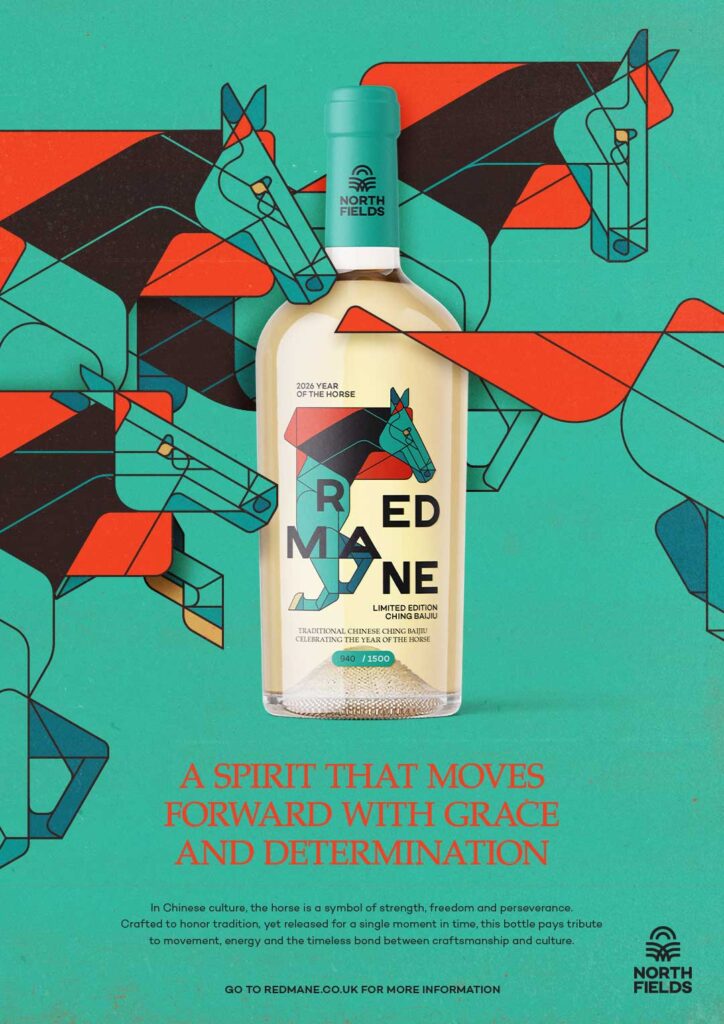
At the heart of the identity is the horse, a powerful symbol in the Chinese zodiac. Traditionally associated with movement, strength, endurance, and progress, the horse becomes the central narrative device for the brand. But instead of relying on ornate, literal illustrations, the project introduces a series of geometric horse forms that function as a dynamic visual system. These illustrations are not standalone artworks. They are modular elements designed to interact, repeat, scale, and evolve across different brand touchpoints.
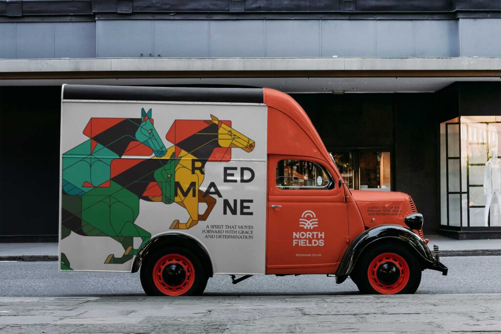
This system-oriented approach is what distinguishes Red Mane from conventional packaging projects. Rather than designing individual assets in isolation, the visual language was conceived as an adaptable framework. Each geometric horse illustration is part of a broader narrative rhythm, where composition and repetition evoke motion and continuity. The result is a sense of progression that mirrors the symbolic qualities of the horse itself.
The design prioritises restraint. In an industry where luxury packaging often leans toward embellishment and decorative excess, Red Mane finds its strength in clarity and structure. The controlled use of geometry, negative space, and alignment ensures that the identity remains impactful whether viewed up close on a bottle label or from a distance on a large-format campaign visual. This scalability is central to the project’s philosophy: a brand identity should hold its integrity across contexts without losing its conceptual core.
Colour, too, plays a critical role. The name Red Mane evokes not only the image of a horse in motion but also the cultural significance of red in Chinese tradition. Red is associated with prosperity, celebration, luck, and vitality, making it a natural anchor for the visual palette. When paired with the disciplined geometry of the illustrations, the colour creates a striking balance between emotion and order, tradition and modernity.
What makes Red Mane particularly compelling is how it demonstrates a way of working rather than simply presenting a finished design. The project reflects a methodology where illustration, branding, and storytelling are developed simultaneously, informing one another from the outset. The horse illustrations are not decorative additions layered onto a brand identity; they are the foundation from which the entire system grows.
This integrated approach allows the identity to extend seamlessly into multiple applications. On packaging, the geometric horses wrap around bottles and boxes in rhythmic sequences, creating a sense of movement as the viewer turns the object in their hands. In large-scale campaign visuals, the same forms expand into bold, graphic statements that command attention without the need for excessive detail. Digitally, the illustrations can be animated or rearranged, maintaining the narrative while adapting to different formats and screens.
The result is a brand that feels alive and adaptable, capable of evolving across media while retaining a consistent conceptual backbone. This flexibility is essential for modern brands, especially those rooted in tradition but seeking relevance in contemporary contexts. Red Mane shows how cultural symbolism can be honoured without being confined to historical aesthetics.
As a conceptual project, Red Mane also highlights the potential of design to explore ideas beyond commercial constraints. Freed from the limitations of an existing brand or client brief, the project becomes a laboratory for testing how far a visual system can stretch while remaining coherent. It asks important questions about how designers can move beyond creating beautiful assets to building meaningful frameworks that support storytelling at every level.
The choice of baijiu as the fictional product adds further depth to the exercise. Baijiu is not merely a beverage; it is a cultural artefact. Designing for it requires sensitivity to history, symbolism, and social context. By focusing on the Year of the Horse, Red Mane taps into a specific moment in the zodiac calendar, giving the project a temporal anchor that enhances its narrative relevance.
Ultimately, Red Mane is a study in how restraint, rhythm, and concept can create a powerful brand language. It demonstrates that strong identities are not built on decorative elements but on systems that can grow, adapt, and communicate meaning consistently. Through its geometric horses and disciplined compositions, the project transforms a traditional symbol into a contemporary visual story.
In doing so, Red Mane does more than imagine the packaging for a fictional spirit. It illustrates how design can bridge heritage and modernity, turning cultural symbolism into a living, scalable identity that moves with the same strength and purpose as the horse it celebrates.
Discover more from Creative Brands
Subscribe to get the latest posts sent to your email.


