

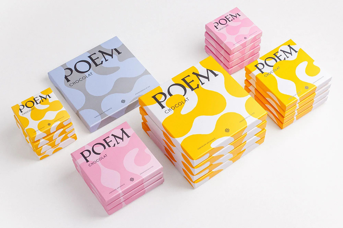
Pomodoro Design Office has crafted a luminous new identity for Poem Chocolate, an artisanal brand that celebrates the joy of fine chocolate. Balancing geometric precision with tactile warmth, the design conveys luxury and approachability, elevating packaging into a narrative of craftsmanship and seasonal flexibility.
In the world of artisanal chocolate, where taste and texture are paramount, visual identity often plays a quieter but equally vital role. For Poem Chocolate, a brand devoted to celebrating the craft and joy of fine chocolate, the challenge was to create a design language that could embody both elegance and accessibility. The task fell to Pomodoro Design Office, whose work has now given the brand a luminous new identity that speaks to its essence while inviting consumers into its story.
Poem Chocolate’s philosophy is rooted in the handmade process, where each bar is more than a confection—it is a crafted experience. Translating that ethos into packaging required a delicate balance: luxury without intimidation, sophistication without sterility, and artistry without excess. Pomodoro Design Office approached the project with a sensitivity to these nuances, ensuring that the brand’s visual presence would resonate with both connoisseurs and casual enthusiasts.
At the heart of the new identity lies a strict geometric type system, a foundation that conveys order, clarity, and premium quality. Yet this precision is softened by a fluid pattern that feels tactile, almost hand-touched, reminding consumers of the artisanal care behind each product. The interplay between geometry and fluidity mirrors the duality of chocolate itself—structured in its form, yet melting into a sensory experience that is deeply personal.
Color plays a central role in the transformation. The solar yellow and white palette chosen by Pomodoro Design Office radiates warmth and optimism, qualities that align with the joy Poem Chocolate seeks to evoke. Yellow, often associated with sunlight and energy, brings a luminous vibrancy to the packaging, while white provides balance, purity, and flexibility. Together, they create a canvas that can adapt to seasonal variations, ensuring the brand remains fresh and relevant throughout the year. Subtle color shifts further enhance special editions, allowing Poem Chocolate to celebrate occasions and milestones without straying from its core identity.
The result is a packaging system that does more than protect and present chocolate—it communicates craftsmanship, joy, and the artisanal essence of the brand. Each box or wrapper becomes a tactile invitation, its design reflecting the handmade process that defines Poem Chocolate. The geometric type reassures with its precision, while the fluid patterns whisper of creativity and care. The solar palette glows with warmth, making the product feel both premium and approachable.
For consumers, this identity is more than visual appeal; it is a narrative. In a marketplace crowded with luxury brands that often lean on exclusivity, Poem Chocolate’s design tells a different story—one of inclusion, joy, and shared experience. The packaging does not intimidate but welcomes, reminding buyers that fine chocolate is not only for special occasions but can be part of everyday delight.
Pomodoro Design Office’s achievement lies in its ability to translate intangible qualities into tangible design. Craftsmanship, joy, and artisanal care are difficult to capture in visuals, yet the new identity succeeds by weaving them into every element. The geometric type system speaks of discipline and mastery, the fluid patterns of human touch, and the solar palette of warmth and celebration. Together, they form a cohesive language that elevates Poem Chocolate without distancing it from its audience.
In many ways, the new identity reflects broader trends in design and branding. Consumers today seek authenticity and connection, gravitating toward brands that feel human and genuine. Luxury, once defined by exclusivity, is increasingly being reimagined as an experience that is both premium and personal. Poem Chocolate’s packaging embodies this shift, offering elegance that is not aloof but inviting, and craftsmanship that is not hidden but celebrated.
The impact of this transformation will likely extend beyond aesthetics. Packaging is often the first point of contact between a brand and its consumer, and for Poem Chocolate, it now serves as a powerful ambassador. The luminous design draws attention on shelves, while its tactile qualities encourage interaction. In a competitive market, such differentiation can be decisive, positioning Poem Chocolate as a brand that not only delivers fine chocolate but also tells a compelling story through its design.
Ultimately, Poem Chocolate’s new identity is a testament to the power of design in shaping perception. By balancing precision with warmth, luxury with approachability, and structure with fluidity, Pomodoro Design Office has created a visual language that resonates with the brand’s ethos. It is a reminder that in the world of artisanal products, design is not merely decoration but an integral part of the experience.
For Poem Chocolate, the journey from craft to consumer is now illuminated by a design that captures its essence. Each bar, wrapped in luminous packaging, becomes more than chocolate—it becomes a poem, written in geometry, color, and touch, celebrating the joy of craftsmanship and the art of indulgence.
Discover more from Creative Brands Mag
Subscribe to get the latest posts sent to your email.


Leave a comment