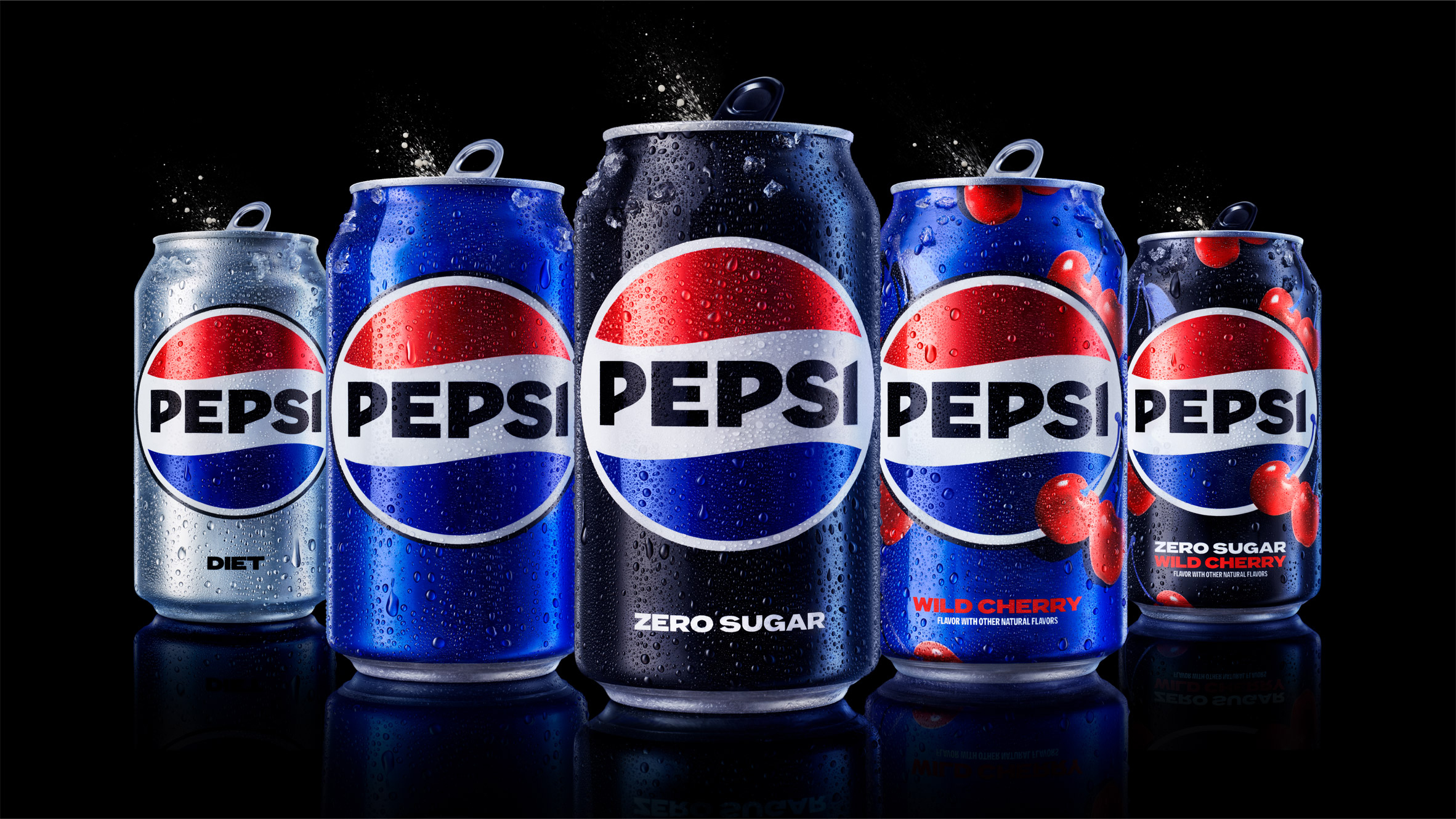
Pepsi, a global beverage giant, has announced a rebrand to its logo and visual identity; a first in 14 years. The new design will roll out in the United States this September in the fall for the brand’s 125th anniversary and across the world in 2024. It will span across all physical and digital touchpoints, including packaging, fountain and cooler equipment, fleet, fashion and dining.
“At PepsiCo, we design our brands to tell a compelling and holistic story. Pepsi is a shining example of a brand that has consistently reinvented itself over 125 years to remain a part of pop culture and a part of people’s lives,” said Mauro Porcini, SVP and chief design officer of PepsiCo in a press release.
“We designed the new brand identity to connect future generations with our brand’s heritage, marrying distinction from our history with contemporary elements to signal our bold vision for what’s to come.”
“Pepsi is an iconic brand that is constantly evolving with the times, as it has been a staple in pop culture and disrupted the category for the past 125 years,” said Todd Kaplan, chief marketing officer, Pepsi.
“We couldn’t be more excited to begin a new era for Pepsi, as this exciting new and modern look will drive brand distinction to show up bigger and bolder and help people find new ways to unapologetically enjoy the things they love. This new visual system brings out the best of the Pepsi brand’s rich heritage while taking a giant leap forward to set it up for success in an increasingly digital world.”

The logo and visual identity borrow equity from its 125-year history and incorporate modern elements to create an current look. Key design elements in the new logo include:
- The Pepsi globe and wordmark unite to fit into a variety of settings and emphasise the distinctive Pepsi branding.
- An updated colour palette introduces electric blue and black to bring contrast, vibrancy, and a contemporary edge to the classic Pepsi colour scheme. Given the brand’s continued focus on Pepsi Zero Sugar, the design brings in the colour black, further showing the brand’s commitment to Pepsi Zero Sugar in the future.
- A new visually distinct can silhouette, which heroes the iconic Pepsi can as an accessible brand for all.
- A modern, custom typeface reflects the brand’s confidence and unapologetic mindset.
- The signature Pepsi pulse evokes the “ripple, pop and fizz” of Pepsi-Cola with movement. It also brings the rhythm and energy of music, an important and continuing part of the Pepsi legacy.
Discover more from Creative Brands
Subscribe to get the latest posts sent to your email.


[…] Brands, C. (2023, March 30). Pepsi rebrands itself after 14 years | Creative Brands. Creativebrandsmag.com. https://www.creativebrandsmag.com/pepsi-rebrands-itself-after-14-years/ […]