
Nuttini, a premium nut butter brand, partners with Visionise to build a warm, minimalist visual identity that celebrates purity, flavour, and ingredient authenticity. Through earthy tones, refined typography, and clean packaging, the brand stands out in the health food aisle as both wholesome and indulgent.
In a market where health shelves are crowded with promises of “natural,” “organic,” and “pure,” standing out requires more than just honest ingredients. It demands a visual language that communicates quality before a jar is even opened. That was the challenge before Visionise when it took on the task of shaping the identity for Nuttini, a premium nut butter brand built around rich, natural spreads made from peanuts, almonds, and cashews.
Nuttini entered a category already bustling with health-conscious options. Consumers browsing these shelves are attentive and informed, scanning labels for clean ingredients and evaluating packaging for authenticity cues. For a new entrant, the task was not only to signal purity and flavour but to do so with an aesthetic that felt trustworthy, elevated, and memorable. The brand needed to speak to the modern consumer who wants both nourishment and indulgence in the same spoonful.
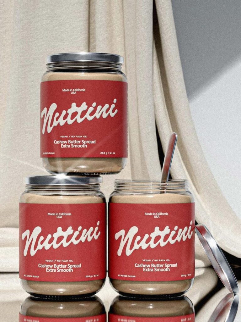
Visionise approached the brief with clarity: the identity would center on warmth, simplicity, and ingredient authenticity. Rather than overwhelming the packaging with claims or cluttered visuals, the design system would let restraint do the talking. This translated into a refined typography palette, earthy colour tones, and clean, spacious layouts that give the products room to breathe on the shelf.
The earthy palette, inspired by the natural shades of peanuts, almonds, and cashews, plays a critical role. These tones immediately evoke a sense of familiarity and wholesomeness, subtly signalling that what’s inside the jar is as natural as it appears. The warmth in the colour system balances the minimalism, ensuring the brand does not feel clinical or austere, a common pitfall in the health food segment. Instead, the visual experience suggests comfort and richness, aligning with the sensory pleasure of nut butters themselves.
Typography, often an overlooked element in food packaging, becomes a central pillar of the identity. Visionise selected a type system that is clean yet expressive, sophisticated without being distant. The letterforms add personality while maintaining legibility, ensuring that product names and information are easily accessible to consumers. This balance reinforces the brand’s dual positioning as both wholesome and indulgent.
The packaging layout follows a principle of quiet confidence. Large, uncluttered spaces frame the product name and key descriptors, allowing each variant to be instantly recognisable. Peanut, almond, and cashew butters are differentiated not through loud graphics but through subtle shifts in colour and labelling, creating a cohesive family of products that still allows individual variants to shine.
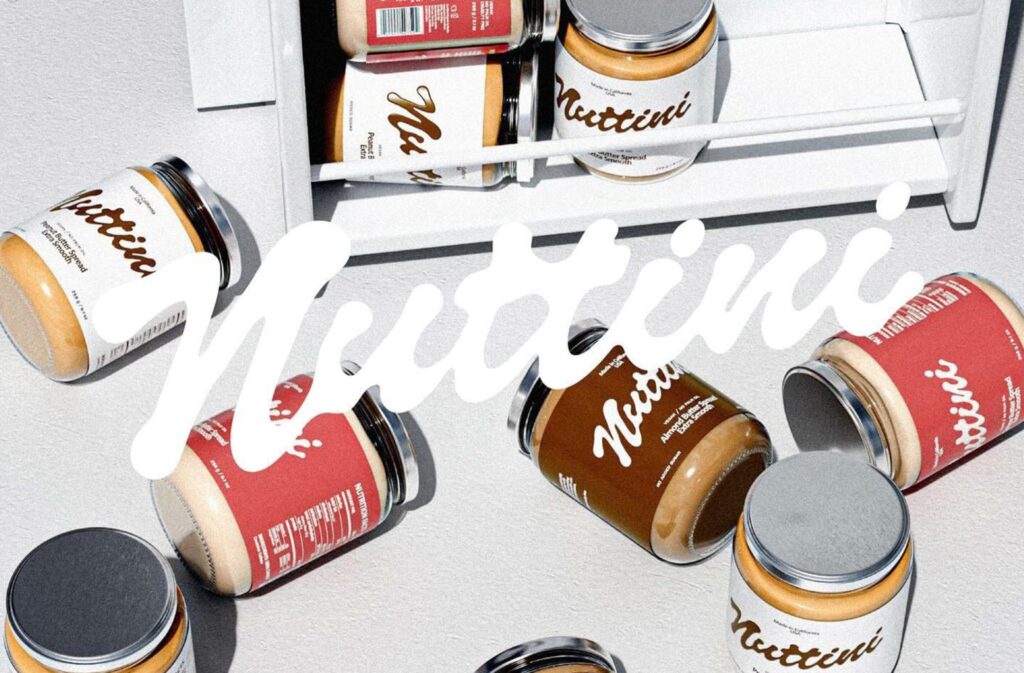
This system extends beyond physical packaging into digital platforms. In today’s market, where brand discovery often happens online before a store visit, consistency across touchpoints is essential. The same warmth, simplicity, and authenticity that define the jars on the shelf carry through to digital assets, ensuring Nuttini’s presence feels seamless whether encountered on a website, social media feed, or retail display.
At its core, the Nuttini identity is about trust. Health-focused consumers are skeptical of overpromises and exaggerated claims. By stripping back unnecessary visual noise, the brand communicates honesty. The design does not shout; it invites. It allows the ingredients and the product quality to be the hero, supported by a visual system that feels natural rather than constructed.
Yet, the brand avoids falling into the trap of appearing too plain. The indulgent aspect of nut butters—the creamy texture, the richness of flavour, the versatility in recipes—is subtly communicated through the warmth of the design. This duality is key: Nuttini is positioned not just as a health staple but as a delightful addition to everyday meals and snacks.
The result is a brand that feels at home in a modern kitchen, equally suited to a breakfast toast, a smoothie bowl, or a late-night spoonful. The identity reflects this versatility, balancing practicality with aspiration. It appeals to consumers who care about what they eat but also seek moments of small indulgence in their daily routines.
For Visionise, the project underscores the growing importance of thoughtful design in the food and beverage sector. As categories become saturated, visual identity becomes a powerful differentiator. In Nuttini’s case, the design does not merely decorate the product; it articulates the brand’s philosophy of purity, flavour, and quality.
Discover more from Creative Brands
Subscribe to get the latest posts sent to your email.


