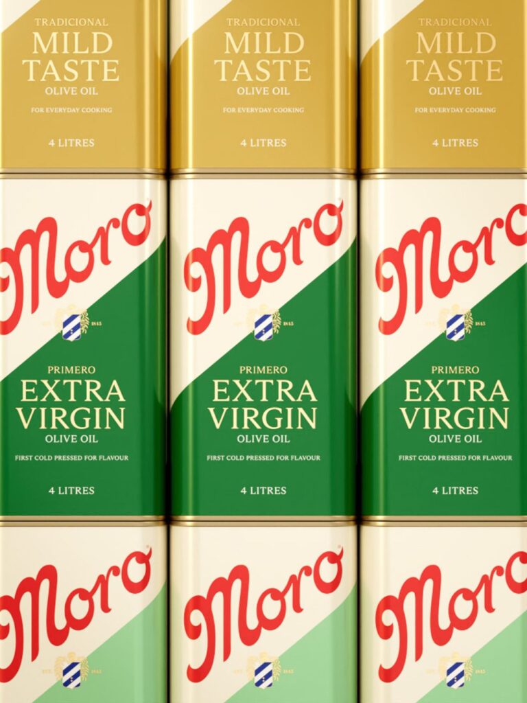
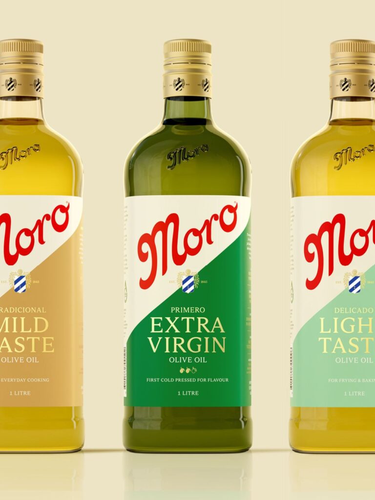
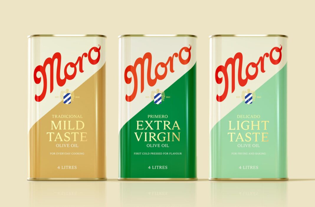
SICKDOGWOLFMAN has refreshed Moro Olive Oil’s long-standing packaging and identity, balancing heritage with modern shelf appeal. By elevating the Moro wordmark, introducing a unifying family crest, and refining bottle forms and typography, the redesign strengthens brand presence, clarifies architecture, and reinforces Moro’s premium quality cues for contemporary kitchens.
Moro Olive Oil has been a quiet constant in Australian kitchens for decades, a staple that many shoppers recognise instinctively but may struggle to describe in detail. Known for its premium Spanish olive oils and vinegars, the brand has long traded on quality and familiarity rather than visual spectacle. Yet in a grocery environment where crowded shelves, private labels and price-led promotions increasingly dictate attention, familiarity alone is no longer enough.
That was the challenge facing independent creative studio SICKDOGWOLFMAN when it was tasked with modernising Moro’s brand identity and packaging system. The goal was not reinvention, but revitalisation: to celebrate Moro’s heritage while ensuring it could compete visually and strategically in a category where split-second decisions are often made at arm’s length in supermarket aisles.

Olive oil is a deceptively competitive category. Bottles jostle for space with similar colour palettes, traditional cues and Mediterranean references. For many brands, differentiation relies on price tags, promotional stickers or claims of origin. Moro, with its long-standing reputation for premium Spanish produce, needed a design system that could communicate quality, authenticity and leadership at a glance, without resorting to clutter or gimmickry.
SICKDOGWOLFMAN’s response was to focus on what had always been at the heart of the brand but had never been fully leveraged as a unifying visual asset: its heritage. Central to the new system is a refined Moro wordmark, elevated in scale and confidence across every format. The wordmark is no longer a supporting element but the primary beacon on shelf, ensuring instant recognition even from a distance.
Anchoring the redesign is the introduction of a family crest, placed deliberately at the heart of the visual language. This crest does more than decorate the label; it acts as a storytelling device and structural anchor for the entire SKU range. In a category that often leans on generic Mediterranean motifs, the crest provides Moro with a distinctive symbol of provenance and continuity, reinforcing the sense that this is a brand with roots, not a newcomer adopting borrowed cues.
The crest also plays a critical role in unifying the growing range of products. Olive oils and vinegars, previously disparate in appearance, now sit comfortably within a coherent system. The visual architecture ensures that while each SKU remains identifiable, the family resemblance is unmistakable. This clarity is particularly important in a category where line extensions and flavour variants can easily fragment brand identity.
Bottle design was another key lever in the transformation. Contemporary shapes replace older forms, subtly signalling a shift towards modernity without abandoning the brand’s premium feel. The new silhouettes are designed to feel comfortable in everyday kitchens while still carrying an air of refinement. They are practical objects first, but ones that communicate care and quality through their proportions and finish.
Typography plays a similarly important role. Confident, clean type supports the wordmark and crest without competing for attention. Information is organised with greater clarity, allowing shoppers to quickly understand what they are buying. In a busy retail environment, legibility is as important as beauty, and the new system strikes a careful balance between the two.
What is perhaps most striking about the redesign is its restraint. Rather than layering on decorative flourishes, SICKDOGWOLFMAN has opted for a pared-back, assured aesthetic that lets Moro’s heritage speak for itself. The result feels timeless rather than trendy, suggesting a brand that is comfortable in its own identity while still aware of contemporary design expectations.
This approach also reinforces Moro’s leadership role within the category. By amplifying quality cues through material choices, typography and form, the packaging signals that Moro is not simply another olive oil option but a benchmark. The design communicates that this is a product to be trusted, a staple elevated by care rather than marketing noise.
For shoppers, the impact is immediate. On shelf, the new Moro stands taller and clearer among its competitors. The bold wordmark and crest create a strong visual block that draws the eye, while the refined bottle shapes add a sense of premium differentiation. The brand no longer risks blending into the background; it asserts its presence with quiet confidence.
For the brand, the redesign offers more than aesthetic improvement. It provides a scalable system that can accommodate future growth without losing coherence. New SKUs can be introduced within the established architecture, maintaining the integrity of the range while allowing for flexibility. In this sense, the project is as much about future-proofing as it is about visual refresh.

SICKDOGWOLFMAN’s work with Moro Olive Oil demonstrates how design can be used to unlock latent brand equity. By identifying and amplifying elements that were already part of Moro’s story, the studio has created a packaging system that feels both authentic and contemporary. It is a reminder that effective branding is often about clarity and confidence rather than novelty.
In everyday kitchens across Australia, Moro bottles may continue to sit quietly beside stovetops and salad bowls. But now, their presence carries renewed clarity and purpose. The redesign ensures that the brand’s long-standing reputation for premium Spanish produce is not only tasted, but seen, recognised and remembered at the point of purchase.
In a category where visibility often determines value, Moro Olive Oil has found a way to honour its past while stepping confidently into the present, proving that even the most familiar pantry staples can be made to feel new again without losing what made them beloved in the first place.
Discover more from Creative Brands
Subscribe to get the latest posts sent to your email.


