
Latitude 16 Organic Gin, born from the rhythms of tropical North Queensland, has unveiled a bespoke bottle designed by Vert in partnership with Coast Distillery. Inspired by the Great Barrier Reef, the award-winning design blends oceanic textures, sustainable values, and coastal storytelling, creating a distinctive identity for the emerging brand.
Latitude 16 Organic Gin is more than a spirit; it is a story bottled in glass, a narrative shaped by the rhythms of the Great Barrier Reef and the relaxed coastal character of tropical North Queensland. Conceived by Coast Distillery and brought to life through a collaboration with Vert, the bespoke bottle design for Latitude 16 Gin (L16) embodies purity, place and personality, reflecting both the organic nature of the spirit and the environment that inspired it.
The brand takes its name from the latitude line that passes through a secluded coral cay on the reef, a location that became the genesis of the gin’s identity. This sense of place is central to the brand’s ethos. Crafted with certified organic ingredients and a considered distillation process, L16 is rooted in responsible sourcing and a strong connection to coastal environments. The bottle design was tasked with translating these values into a tangible form, one that could express the coastal spirit and establish a distinctive presence in the world of premium gin.
The design journey began with an exploration of bottle anatomy. Vert’s team compared refined, elongated necks with soft shoulders against more grounded profiles with shorter necks and wider bases. This study helped define the silhouette and presence of the bottle, ensuring that its form would resonate with the brand’s coastal inspiration while remaining practical for production and use.
Early concepts explored a wide range of coastal themes, from ocean movement and marine ecology to coastal architecture and navigation. Seafaring became the guiding motif, shaping the form, texture and visual narrative of the bottle. One direction drew inspiration from the ocean itself, employing a teardrop shape and textured surfaces to mimic flowing currents. Another concept looked to coral, using a classic silhouette enhanced with subtle micro-textures based on the geometric patterns found in coral formations. Other explorations took on distinctive shapes inspired by lighthouses and ocean buoys, each offering a different interpretation of coastal identity.
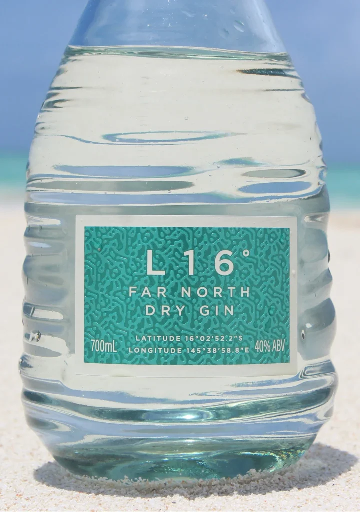
Vert’s expertise in glass bottle design allowed the team to push boundaries while remaining grounded in material constraints and production realities. The chosen direction incorporated textured patterns inspired by the ocean, translating the reef’s light, colour and rhythm into the bottle’s design. The result was a vessel with a traditional expression, evoking the timeless idea of a “message in a bottle.” Craft-led methods such as hand-blown glass were considered during development, underscoring the artisanal spirit of the brand.
The next stage of design focused on refining the neck geometry and headspace. Ripples flow up from the base of the bottle, more pronounced at the bottom and gradually transitioning upwards. These textures are continuous across the entire vessel rather than confined to a single section, creating a sense of movement and unity. Generated in CAD using an algorithmic, randomised approach, the ripples capture the unpredictability and beauty of water currents, ensuring that each bottle carries a unique visual rhythm.
Material selection was equally important. Vert worked closely with the manufacturer to choose a natural glass with a subtle blue-green tint. This choice enhances clarity while reflecting the movement of water from the Great Barrier Reef, reinforcing the brand’s connection to its place of origin. The tint lends the bottle a serene, coastal character, aligning perfectly with the organic purity of the gin inside.
Collaboration extended beyond the bottle itself. Packaging and brand designer Clay Andrews developed the coastal-inspired sleeve and graphics, ensuring that the visual identity worked in harmony with the glass design. The graphics evoke the feeling of being in the ocean, capturing light, colour and calm. A soft green wash on the neck label references shifting tides, while the main label features an iridescent finish that responds to light, creating a dynamic interplay between bottle and environment.
Structural considerations were also addressed with precision. An embossed base on the bearing surface of the bottom ring ensures stability, reduces damage during production and minimises breakage. Acting as the load-bearing point of the bottle, this feature is essential for durability and handling. The embossing also references the brand’s northern latitude and URL, marking the place at the heart of L16 and reinforcing its geographical identity.
The final bottle is a custom glass design defined by subtle ripples that echo the water surrounding the coral cay. These ripples provide both visual character and a confident grip for pouring, marrying aesthetics with functionality. The form reflects the tranquillity and clarity of its Great Barrier Reef inspiration, shaped by nature over time. More than a vessel, it establishes a distinctive, ownable standard for the Latitude 16 Gin brand.
Designed to be shared, savoured and kept, the bottle mirrors the ebb and flow of ocean currents, encapsulating the beauty, serenity and movement that define L16. It is a bottle that invites consumers not only to enjoy the gin but also to connect with the story of its origin, to feel the rhythm of the reef and the calm of the coast.
Recognition has already followed. The bottle and brand identity for Latitude 16 Gin have been awarded Gold at the World Brand Design Society Awards, a testament to the success of the collaboration between Coast Distillery, Vert and Clay Andrews. The award acknowledges not only the aesthetic achievement but also the brand’s commitment to sustainability, storytelling and innovation in design.
Behind the project were Vert’s lead designers Charlie Payne, Rikefe Ohwosi, Sabrina Piro and Andrew Simpson, whose combined expertise shaped the bottle into a work of art. Their ability to balance abstract ideas with production realities ensured that the final design was both imaginative and practical, a true reflection of the brand’s values.
Latitude 16 Organic Gin is now available to discover and purchase online, with its story continuing to unfold across social platforms. More than a drink, it is an experience of place, purity and personality, a spirit that carries the essence of the reef in every pour. The bottle stands as a symbol of what can be achieved when design, craft and storytelling converge, offering a glimpse of the future of spirits branding—one where sustainability, identity and artistry flow together as seamlessly as the currents of the ocean.
Discover more from Creative Brands
Subscribe to get the latest posts sent to your email.


