
RoAndCo Studio crafts a vibrant new identity for Kin Euphorics, blending playful revelry with sophisticated wellness. Through botanical colours, fluid typography, and nostalgic-modern design cues, the rebrand introduces a new functional beverage category while positioning Kin as a cultural symbol of conscious connection and elevated social rituals.
In a market where shelves are crowded with drinks promising energy, calm, focus, or detox, Kin Euphorics is asking a different question: what if beverages could reshape the way we gather, celebrate, and connect—without alcohol? As a pioneering non-alcoholic brand built on nootropics, adaptogens, and botanicals, Kin sits at the intersection of wellness and social ritual. But introducing an entirely new category requires more than an innovative product; it demands a compelling story and a distinctive visual world. That challenge fell to RoAndCo Studio, which has crafted a brand identity and visual system that feels as energising and thoughtful as the drinks themselves.
Kin Euphorics is not simply offering a healthier alternative to alcohol. It is reframing what social indulgence can look and feel like. The brand’s promise lies in creating moments of connection, clarity, and elevated well-being through functional ingredients designed to support mood and mind. Yet translating this nuanced proposition into an instantly recognisable brand language in a saturated beverage market is no small feat. The visual identity needed to carry both the celebratory spirit of nightlife and the grounded sensibility of wellness culture—two worlds that often sit at odds.
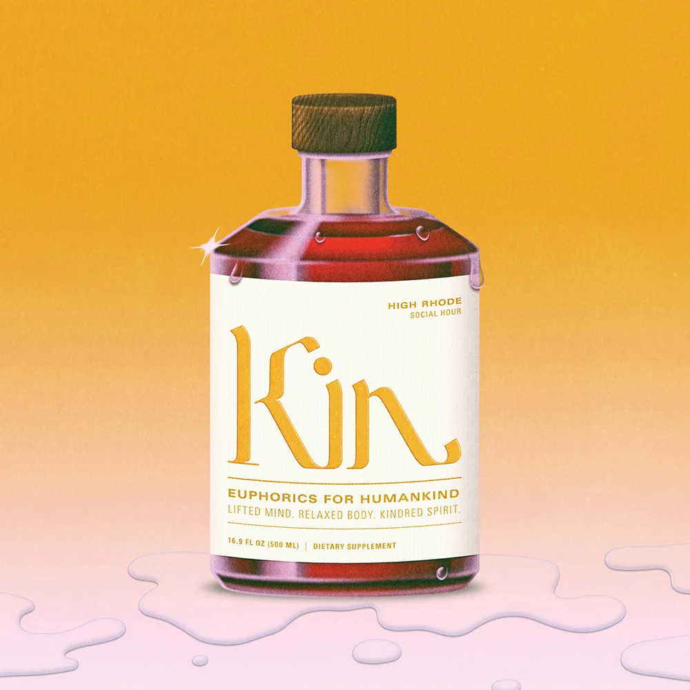
RoAndCo’s solution begins with colour. Vibrant botanical hues pulse through the brand system, drawing directly from the ingredients that define Kin’s formulations. These colours are not muted or medicinal; they are lively, inviting, and almost electric, signalling energy and joy. At the same time, their natural origins root the brand firmly in the language of plant-based wellness. This careful chromatic balance allows Kin to feel playful without losing credibility, expressive without veering into chaos.
The logotype plays an equally central role. Designed as a fluid, calligraphic form, it evokes movement, connection, and human touch. There is a sense of flow to the typography that mirrors both the liquid nature of the product and the emotional continuity Kin seeks to foster among its drinkers. It feels personal, almost handwritten, suggesting intimacy and shared experience rather than corporate polish. This typographic gesture helps soften the edges of a category that could easily become clinical or overly functional in its communication.
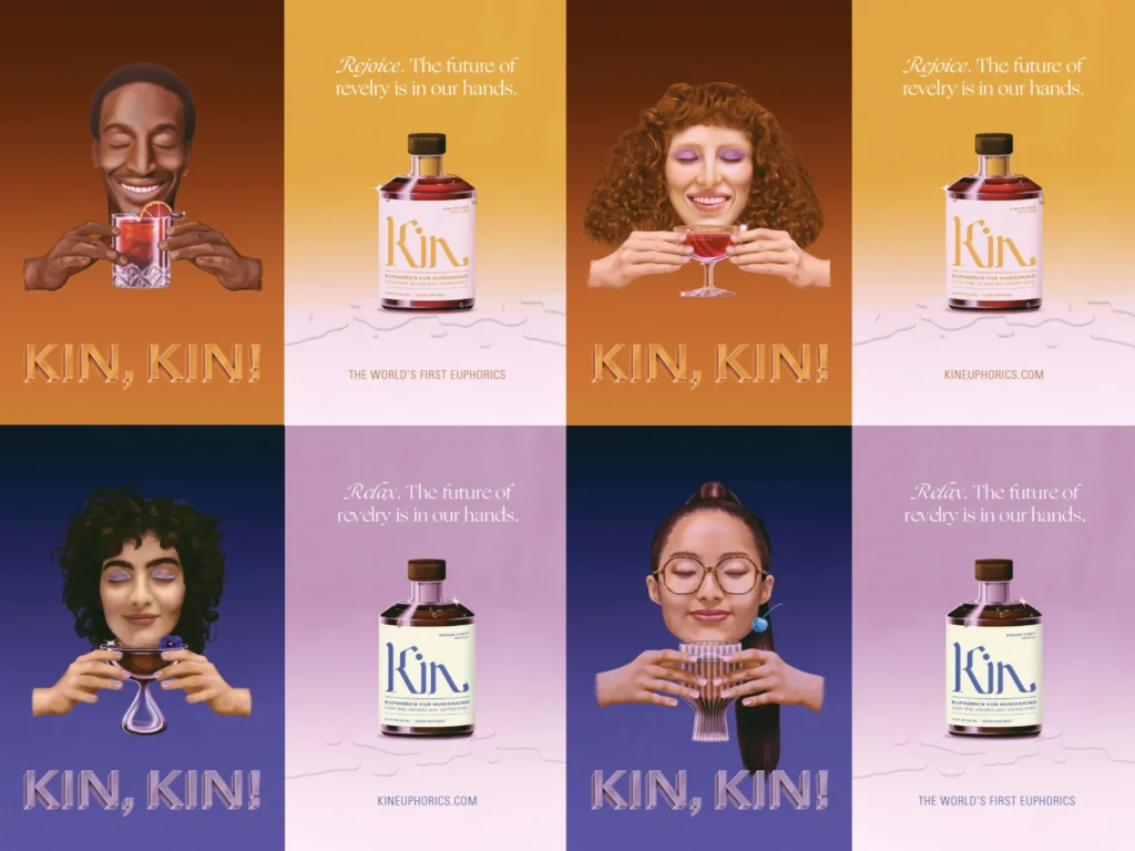
Packaging becomes the primary stage for this identity to perform. Bottles and cans are transformed into canvases where botanical vibrancy meets nostalgic visual references. RoAndCo draws on retro design cues—echoes of vintage apothecaries, old-world labels, and analogue print textures—then reinterprets them with contemporary clarity. The result is packaging that feels familiar yet forward-looking, inviting consumers to explore the product without feeling overwhelmed by its scientific underpinnings.
This nostalgic-modern interplay serves an important purpose. For many consumers, nootropics and adaptogens remain unfamiliar concepts. Rather than presenting them through dense scientific jargon, Kin’s visual language makes the category approachable. The design educates through mood and feeling rather than instruction, allowing curiosity to lead discovery. It subtly reframes functional ingredients as part of a lifestyle rather than a prescription.
Beyond the pack, the campaign art direction extends this philosophy into broader cultural storytelling. Imagery celebrates moments of revelry that feel inclusive and conscious—friends gathered in laughter, late-night conversations, sunlit mornings after. These scenes do not rely on the tropes of traditional alcohol advertising. Instead, they depict connection as something that can be heightened through clarity rather than intoxication. The visual system ensures that every touchpoint, from social media to point-of-sale, reinforces this new narrative of celebration.
RoAndCo’s work also positions Kin as more than a beverage; it becomes a cultural statement. The brand’s aesthetic aligns with communities seeking balance between pleasure and purpose, nightlife and mindfulness. It speaks to a generation redefining indulgence, where well-being does not come at the cost of enjoyment. In this way, the identity does the heavy lifting of category creation, signalling that Kin belongs to an entirely new conversation.
Importantly, the design avoids the trap of looking like a typical wellness brand. There are no sterile whites or subdued earth tones dominating the palette. Instead, Kin pulses with color, personality, and movement. This deliberate departure ensures the brand can sit comfortably in social settings—on bar counters, at dinner tables, in party scenes—without feeling out of place. It is well dressed for the night out.
The visual system’s flexibility allows Kin to scale across formats and environments while maintaining coherence. Whether seen in a retail display, a digital campaign, or an event activation, the brand retains its signature balance of energy and sophistication. This consistency is crucial for building recognition in a nascent category where consumers are still learning what to look for.
Ultimately, RoAndCo’s rebrand accomplishes something rare: it makes the unfamiliar feel instinctively desirable. By weaving together botanical inspiration, expressive typography, and nostalgic cues, the studio has created an identity that mirrors Kin’s mission of conscious connection. It invites consumers to rethink their rituals, offering a new way to gather that feels both joyful and restorative.
As functional beverages continue to grow in popularity, Kin Euphorics now stands out not just for what is inside the bottle, but for how it presents itself to the world. Through thoughtful design, the brand articulates a future where celebration and wellbeing are not opposites but companions. In doing so, it transforms a drink into an experience—and a category into a culture.
Discover more from Creative Brands
Subscribe to get the latest posts sent to your email.


