
Historic Dorset brand Eldridge Pope & Co. has been revived as a premium spirits label through a bold redesign by CuCo Creative. Blending 150 years of heritage with contemporary craft aesthetics, the new identity spans gins and liqueurs, delivering strong shelf presence, tactile packaging, and a future-ready brand system rooted in history.
When a brand has been shaping a town’s drinking culture for nearly two centuries, its return cannot be tentative. Eldridge Pope & Co., founded in 1833 and once the beating heart of Dorset’s brewing identity, has chosen to re-enter the drinks world not with a quiet nod to the past but with a confident statement of intent. In reviving the historic name as a premium spirits player, the company has embarked on a transformation that honours its heritage while speaking fluently to the expectations of today’s craft spirits consumer. Central to this revival is a carefully considered brand and packaging redesign by CuCo Creative, tasked with turning history into something tangible, contemporary, and commercially compelling.
For generations, Eldridge Pope & Co. was more than a brewery; it was a local institution. Its presence was woven into Dorchester’s streets, its pubs, and its social life. Over time, however, the name faded from bottles and bars, surviving largely as a memory etched into old buildings and local lore. The ambition behind the revival was not to trade solely on nostalgia, but to re-establish Eldridge Pope & Co. as a living, evolving brand with relevance in a competitive premium market. The starting point was spirits, with a range of gins and liqueurs designed to signal quality, confidence, and longevity.
The challenge CuCo Creative faced was deceptively complex. How do you reinvent a heritage brand without stripping it of authenticity? The aim was to appeal to discerning spirits drinkers aged 35 to 60, consumers who value provenance and craft but also expect modern design and clarity. At the same time, the identity had to be robust enough to stretch across future categories, including wine and even a potential return to beer. This was not a one-off packaging exercise but the creation of a full brand system that could endure.
CuCo Creative approached the task as what they describe as brand archaeology. Instead of inventing a story, they excavated one. Research took them deep into Dorchester’s Edwardian architecture, where arches, curves, and proportions offered visual cues that would later influence the softened elegance of the logo. They rediscovered the Huntsman trademark first used in 1921, a symbol that once stood proudly for the brewery’s strength and reach. Historic gothic typefaces, which had originally proclaimed the brand from brewery walls and signage, were studied not as relics but as living design assets capable of reinterpretation.
From these elements, a new identity began to take shape, one that blends past and present rather than forcing a choice between them. The result is an aesthetic that feels rooted yet refined, traditional but not dated. Bold typography anchors the labels, while Roman-inspired details add structure and confidence. The visual language suggests craft and authority, designed to sit comfortably among premium spirits while still standing apart.
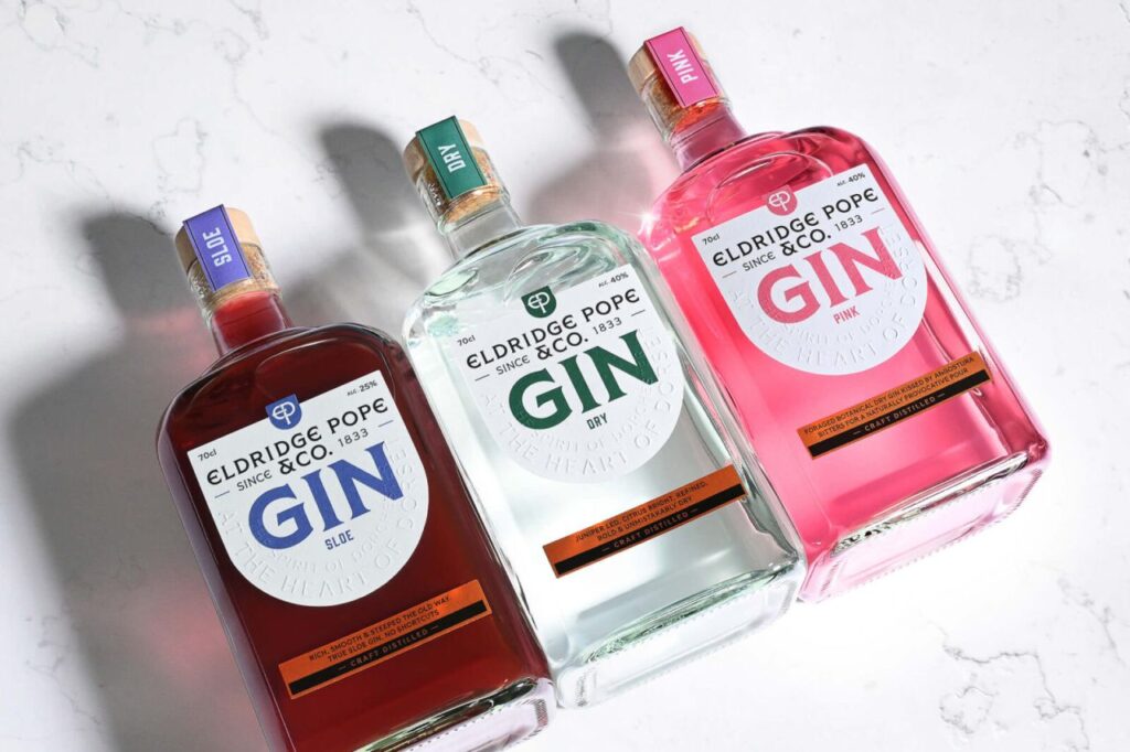
This identity was rolled out across a diverse spirits range: three gins, two liqueurs in ginger and coffee, a special edition gin, and a 0% gin. Each bottle is unmistakably part of the same family, unified by a strong umbrella design, yet each has enough individuality to communicate its own character. This balance ensures strong shelf recognition without sacrificing personality, a crucial factor in a crowded retail environment.
Production techniques play a vital role in elevating the design from attractive to memorable. Copper foiling glints across the labels, a deliberate nod to the brewery’s historic copper fermentation tanks and a subtle reference to the craft of making. Embossed straplines add a tactile dimension, encouraging consumers to engage not just visually but physically with the bottle. The effect is one of considered luxury rather than excess, aligning with the expectations of premium spirits buyers who value detail and restraint.
The logo itself underwent careful remastering. The original crest was softened, its lines refined into elegant curves inspired by Dorchester’s Edwardian arches. This adjustment was not merely aesthetic; it was symbolic, intended to mirror the smoothness and refinement of the liquid inside the bottle. Typography was similarly reimagined, with remastered gothic serifs paired alongside contemporary Romanesque forms. The combination delivers clarity and legibility while retaining character and historical resonance.
Beyond visuals, storytelling sits at the heart of the revival. CuCo Creative developed the Eldridge Pope & Co. narrative from the ground up, weaving together its long history, Dorset roots, and forward-looking ambition. This narrative informs every word that appears on the packaging, from straplines to detailed label copy. A comprehensive brand language document was created to ensure consistency and confidence across all communications, giving the Eldridge Pope & Co. team a clear voice as the brand grows and expands into new categories.
What makes the revival distinctive is the way every detail acknowledges the past without being constrained by it. The Huntsman returns, reimagined in a bold red that feels contemporary yet symbolic. Copper foiling catches the light like a Dorset sunset, evoking place as much as process. Neck labels do more than decorate; they tell stories while protecting the liquid inside, reinforcing the sense that every element has purpose.
This approach transforms the packaging into a sensory experience. The embossed words invite touch, the typography guides the eye, and the materials signal quality before the bottle is even opened. It is branding designed to be felt as much as seen, reflecting an understanding that premium spirits are often chosen as gifts or for special occasions, moments when presentation carries added weight.
The impact of the revival is already visible. Eldridge Pope & Co. is no longer a name remembered only through faded signage; it is back on shelves, confidently positioned as Dorset’s flagship name in drinks once more. The unified packaging line delivers instant recognition and strong shelf presence, helping the brand compete in a market where first impressions matter immensely. More importantly, the system is future-proofed. Whether the brand extends further into spirits, re-enters beer, or explores wine, the identity provides a cohesive framework that can adapt without losing coherence.
In reviving Eldridge Pope & Co., CuCo Creative and the brand’s custodians have demonstrated that heritage, when handled thoughtfully, is not a limitation but a powerful asset. By safeguarding the past while unlocking the future, they have created a brand that feels authentic rather than retrospective, confident rather than cautious. It is a reminder that great brands are not frozen in time; they evolve, carrying their stories forward into new chapters.
Nearly two hundred years after it first began pouring, Eldridge Pope & Co. is once again raising glasses, not just in remembrance of what it was, but in anticipation of what it can become. The revival stands as a testament to the enduring appeal of well-crafted drinks, thoughtful design, and storytelling that respects where a brand has come from while daring to imagine where it might go next.
Discover more from Creative Brands
Subscribe to get the latest posts sent to your email.


