
California’s Desert Coffee, created by Sergio Laskin, has unveiled a striking packaging identity designed to cut through the clutter of the crowded coffee market. With metallic finishes, vivid yellow accents, and a fierce tiger motif, the brand balances premium craft with playful energy, ensuring instant recognition and lasting shelf presence.
In the ever-expanding universe of coffee culture, where shelves are lined with countless blends, roasts, and origins, standing out has become as important as the quality of the beans themselves. Desert Coffee, a California-based packaged coffee brand, has embraced this challenge head-on, unveiling a packaging identity that is as bold and expressive as the product it represents. Conceived by designer Sergio Laskin, the brand’s new look is a study in confidence, attitude, and visual daring, crafted to ensure that Desert Coffee is not just another name in the crowded category but a symbol of strength and character.
The coffee aisle has long been a battleground of aesthetics. From artisanal craft labels that whisper authenticity to sleek modern designs that promise sophistication, brands have sought to capture consumer attention through packaging as much as through taste. Desert Coffee’s challenge was to carve out a space that felt premium yet playful, a balance that would resonate with both seasoned coffee enthusiasts and casual buyers. The solution had to be more than decorative; it needed to embody the brand’s spirit, communicate its craft credentials, and remain memorable long after the first glance.
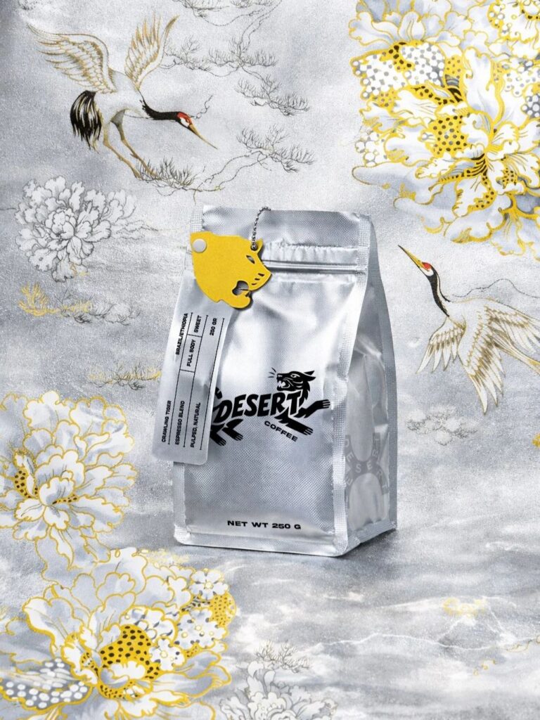
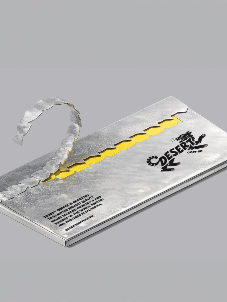
Laskin’s answer was to create a visual system that thrives on contrast and energy. At the heart of Desert Coffee’s identity lies a striking metallic package, its reflective surface immediately commanding attention under store lights. This shimmering backdrop is punctuated by vivid yellow accents, a color choice that injects vibrancy and warmth while signaling optimism and dynamism. The metallic and yellow pairing is not accidental—it is a deliberate play of premium and playful, a duality that defines the brand’s ethos.
But the true centerpiece of Desert Coffee’s packaging is the tiger motif. Fierce yet elegant, the tiger serves as a symbol of strength, resilience, and individuality. In a marketplace where many brands lean on abstract patterns or minimalist typography, Desert Coffee’s tiger roars with personality. It is not merely a decorative element but a confident emblem, reinforcing the brand’s character and ensuring instant recognition. The tiger embodies the energy of the desert itself—untamed, powerful, and unforgettable.
This cohesive visual identity does more than catch the eye; it tells a story. The metallic finish speaks to modernity and craft, suggesting a product that is carefully curated and of high quality. The yellow accents bring in a sense of playfulness, reminding consumers that coffee is not just a ritual but also a source of joy and vitality. The tiger motif ties it all together, offering a symbol that is both aspirational and relatable. Together, these elements create a packaging system that feels unmistakably Desert Coffee, a brand that refuses to blend into the background.
The importance of such a design cannot be overstated in today’s retail environment. With consumers often making split-second decisions based on visual cues, packaging has become a critical tool in shaping perception and driving purchase. Desert Coffee’s bold identity ensures that it does not merely compete for attention but commands it. The metallic shine draws the eye, the yellow accents hold it, and the tiger leaves a lasting impression. It is a choreography of design elements that work in harmony to deliver impact.
Beyond aesthetics, the packaging reflects a deeper understanding of brand storytelling. Coffee is more than a beverage; it is an experience, a ritual, a moment of connection. Desert Coffee’s identity captures this by offering packaging that feels alive, expressive, and full of character. It invites consumers to see the brand not just as a product but as a companion in their daily journey. The tiger becomes a symbol of empowerment, the metallic finish a promise of quality, and the yellow accents a reminder of joy.
In positioning itself this way, Desert Coffee also acknowledges the evolving expectations of consumers. Today’s buyers seek authenticity but also crave excitement. They want brands that feel premium but not pretentious, playful but not frivolous. Desert Coffee’s packaging strikes this delicate balance, offering a design that is sophisticated yet approachable, bold yet inviting. It is a reflection of a brand that understands its audience and speaks to them with clarity and confidence.
The result is a packaging identity that is not only visually striking but also strategically sound. It reinforces Desert Coffee’s craft credentials while carving out a distinctive voice in the marketplace. It ensures that the brand is not just seen but remembered, not just purchased but cherished. In a category where sameness can be the enemy, Desert Coffee has chosen to be unmistakable.
Sergio Laskin’s work on Desert Coffee is a reminder of the power of design in shaping brand destiny. By combining metallic finishes, vivid yellow accents, and a tiger motif, he has created a system that is modern, expressive, and full of attitude. It is a design that does not shy away from boldness but embraces it, turning packaging into a statement of identity.
As Desert Coffee takes its place on shelves, it does so with a roar rather than a whisper. Its packaging is not just a container but a canvas, telling a story of strength, character, and joy. In a world where coffee brands often struggle to differentiate, Desert Coffee has found its voice—a voice that is confident, playful, and unmistakably its own.
At 900 words, this feature captures the essence of a brand that understands the importance of standing out. Desert Coffee is more than a product; it is a symbol of how design can transform perception, elevate experience, and create lasting impact. With its bold packaging identity, Desert Coffee is ready to be remembered—not just as another coffee, but as the coffee that dared to roar.
Discover more from Creative Brands
Subscribe to get the latest posts sent to your email.


