
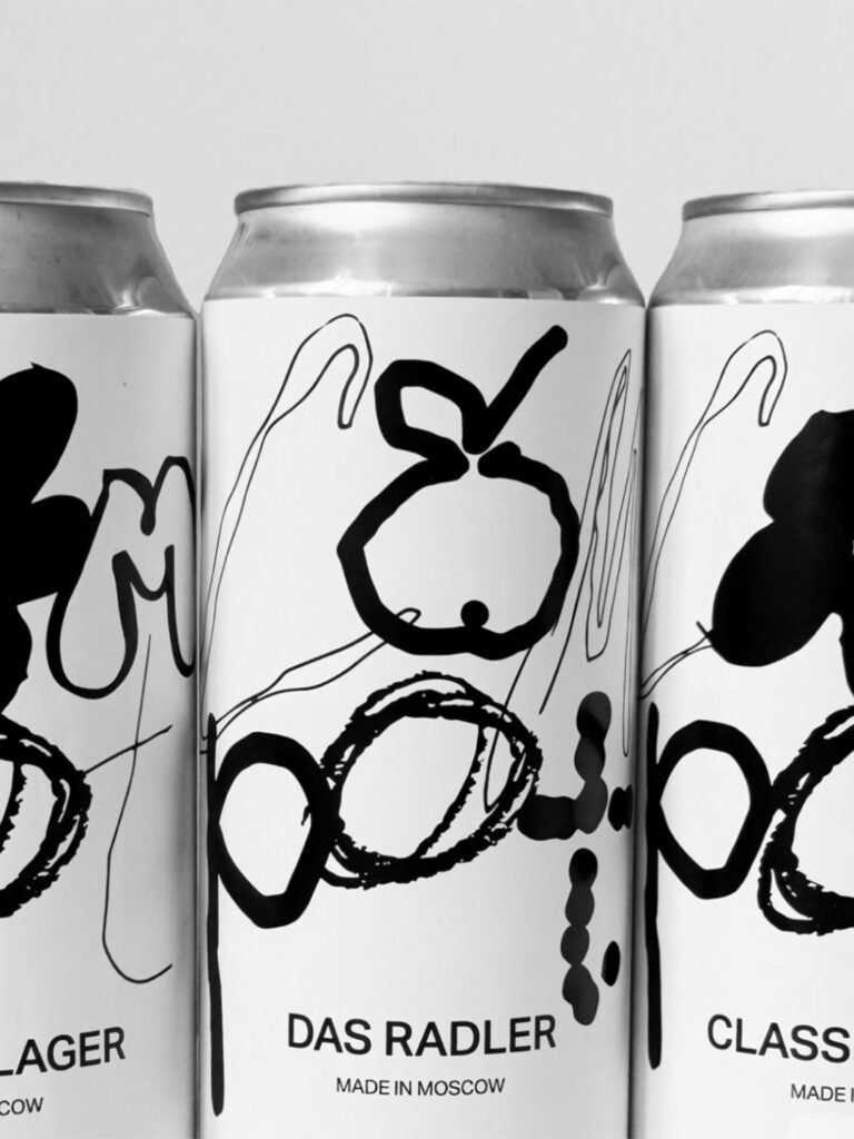
Designer Tatiana Komarova introduces Compot, a light, low-alcohol beer inspired by the traditional homemade fruit drink kompot. With hand-drawn typography and restrained, tactile packaging, the brand repositions beer as warm, casual, and culturally familiar—standing out on shelves through subtlety rather than spectacle.
In a beverage market often dominated by bold graphics, metallic finishes, and high-impact branding, a new light, low-alcohol beer is choosing a quieter path to recognition. Compot, created by designer Tatiana Komarova, draws its identity not from the usual codes of modern beer marketing but from the soft familiarity of a traditional homemade fruit drink known as kompot. The result is a brand that reframes beer as gentle, approachable, and culturally resonant, offering a different kind of shelf presence—one rooted in memory rather than noise.
Kompot, a fruit-based drink commonly prepared in households across Eastern Europe and parts of Central Asia, is associated with care, domestic rituals, and shared meals. It is less a product than a gesture—fruit simmered slowly, served chilled or warm, and poured generously into glasses at family tables. By referencing this cultural touchstone, Compot the beer borrows from an emotional vocabulary that feels intimate and unpretentious. Instead of positioning itself as daring, extreme or hyper-modern, the brand leans into ease and everyday comfort.
The strategic challenge was clear: how do you reposition beer, a category often saturated with tropes of masculinity, nightlife, or craft complexity, as something light and familiar without diluting its identity? For Komarova, the answer lay in simplicity—not as an aesthetic afterthought but as a disciplined design principle. The packaging had to communicate warmth and clarity at once, to feel contemporary without becoming sterile, and distinctive without overwhelming the senses.
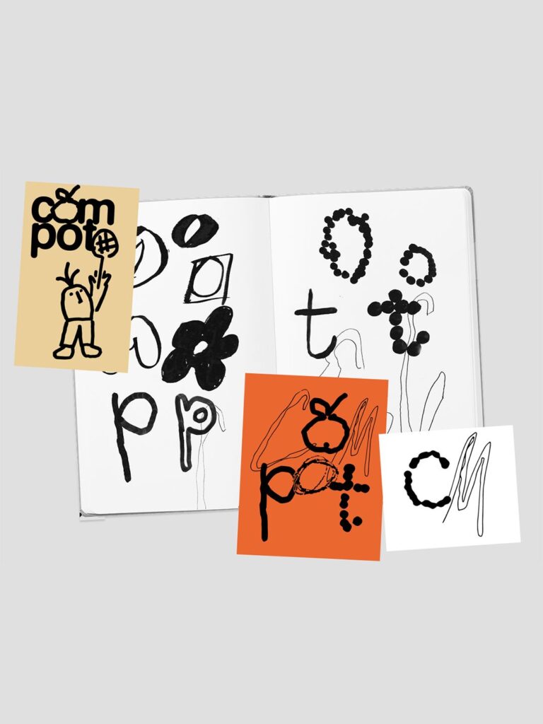
At the heart of Compot’s visual system is hand-drawn typography. The lettering carries a slightly imperfect, tactile quality, evoking the human touch of homemade recipes and handwritten labels on jars of preserved fruit. This typographic choice subtly signals craft without aligning with the heavily ornamented codes of many craft beer brands. Instead, it introduces softness—an approachable tone that suggests the beer is meant for casual, everyday enjoyment rather than ceremonial tasting.
The typography sits within a clean, minimal layout. Negative space plays a central role, allowing the hand-rendered elements to breathe. Rather than layering the can or bottle with complex illustrations or loud color blocking, the design employs subtle graphic elements that gently reinforce the concept. These details—delicate linework, restrained colour palettes, and carefully balanced composition—create a packaging system that feels cohesive and calm.
In a retail environment where products compete aggressively for attention, Compot’s restraint becomes its differentiator. The beer stands out not because it shouts, but because it pauses. Amid shelves crowded with high-contrast visuals and assertive messaging, the softness of Compot’s design invites a second glance. It signals confidence through understatement, trusting that consumers will respond to clarity and authenticity.
The low-alcohol positioning further strengthens this narrative. As global drinking habits evolve and moderation becomes more mainstream, light beers and low-alcohol options are gaining traction. Yet many of these products still rely on traditional beer branding cues. Compot’s approach feels aligned with a broader cultural shift toward balance and intentional consumption. It presents beer not as a high-energy catalyst but as a companion to relaxed gatherings, afternoon conversations, and everyday rituals.
By anchoring the brand in the cultural reference of kompot, Komarova also introduces an element of storytelling that transcends trend. The name itself acts as both a concept and a conversation starter. For those familiar with the drink, it triggers nostalgia; for those encountering it for the first time, it invites curiosity. In both cases, the reference enriches the product with meaning beyond flavour profile or alcohol percentage.
The packaging’s tactile quality reinforces this narrative dimension. Even in visual form, the hand-drawn typography suggests texture—an echo of the handmade. This stands in quiet contrast to the industrial precision often associated with beverage packaging. It humanises the brand, making it feel closer to the kitchen table than the nightclub bar.
Importantly, the design avoids slipping into overt nostalgia. While it references tradition, it does not mimic vintage labels or retro aesthetics. The clean layout and contemporary sensibility keep Compot firmly in the present. This balance between memory and modernity allows the brand to feel relevant without chasing visual trends. It positions Compot as a bridge between generations: familiar enough to evoke comfort, refined enough to belong in a modern retail setting.
The restrained palette and careful composition also suggest a product that is uncomplicated. There is no dense block of messaging competing for attention. Instead, clarity becomes a form of trust. Consumers can quickly understand what the product represents—light, low-alcohol, easygoing—without decoding layers of branding theatrics.
Discover more from Creative Brands
Subscribe to get the latest posts sent to your email.


