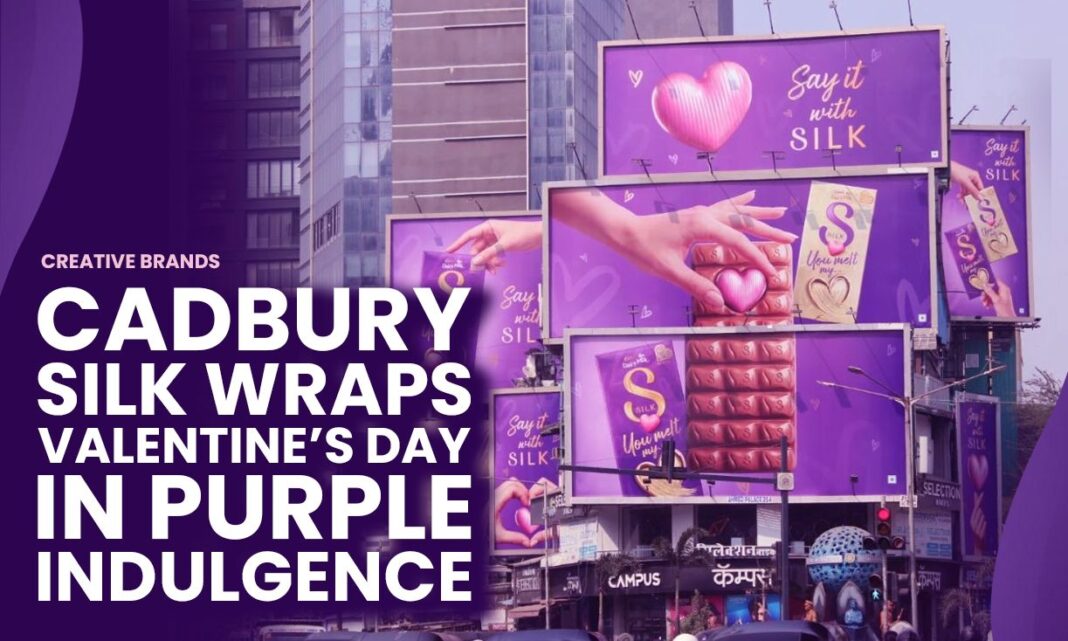
Cadbury Silk’s Valentine’s Day OOH campaign turned cityscapes into a canvas of indulgence, painting them in its signature purple. With hoardings declaring “Wrapped in silk, end to end,” the brand created an ambient presence that was soft, romantic, and unmistakably Silk, weaving love and luxury into everyday spaces.
Cadbury Silk has long positioned itself as the chocolate of indulgence, romance, and tender gestures. This Valentine’s Day, the brand elevated that promise beyond the box and into the streets, orchestrating an out-of-home (OOH) campaign that literally painted the town purple. In a season where brands jostle for attention with declarations of love, Cadbury Silk chose to weave its narrative into the urban fabric, making its presence ambient, soft, and unmissably Silk.
The campaign’s visual language was simple yet striking. Hoardings across key city locations carried the caption “Wrapped in silk, end to end,” a phrase that captured both the tactile luxury of the product and the emotional embrace it represents. The purple hue, synonymous with Cadbury, became more than a colour—it was a mood, a signal of indulgence, and a reminder of the brand’s association with romance. By saturating public spaces with this identity, Silk ensured that Valentine’s Day was not just celebrated privately between couples but also publicly, with the city itself dressed in its signature shade.
The strategy behind this rollout was clear: to make indulgence feel ambient. Rather than shouting for attention, Silk’s campaign whispered romance into the everyday commute, the walk to work, or the evening drive. The hoardings were not aggressive advertisements but atmospheric cues, designed to evoke softness and intimacy. In doing so, Cadbury Silk demonstrated an understanding of how modern consumers engage with brands—not through loud proclamations but through subtle, immersive experiences that blend seamlessly into their environment.
This approach also reflects the evolution of OOH advertising. Traditionally, billboards were about scale and visibility, often competing for attention with bold graphics and loud messaging. Silk’s campaign, however, leaned into restraint. By focusing on mood and ambience, it transformed OOH into an extension of the brand’s personality. The purple visuals did not demand attention; they invited it. They created a sense of indulgence that was both personal and collective, reminding passersby that love, like chocolate, can be shared in quiet, everyday moments.
Valentine’s Day has always been a crucial occasion for Cadbury Silk. Positioned as the chocolate of choice for romantic gifting, Silk has consistently crafted campaigns that tie indulgence to intimacy. From television commercials that dramatise tender exchanges to digital activations that encourage personalised gestures, the brand has built a strong association with love. This year’s OOH rollout extended that narrative into public spaces, ensuring that the brand was not just part of private celebrations but also part of the city’s collective Valentine’s mood.
The choice of purple as the dominant visual element was particularly effective. Colour psychology suggests that purple evokes luxury, creativity, and romance. For Cadbury Silk, it is also a brand signature, instantly recognisable and deeply embedded in consumer memory. By flooding the city with this hue, the campaign created a visual monopoly, ensuring that Valentine’s Day was seen through a Silk-tinted lens. The effect was both immersive and memorable, reinforcing the brand’s identity while amplifying its emotional resonance.
What makes this campaign noteworthy is its ability to balance scale with subtlety. Large hoardings and widespread visibility gave it reach, but the softness of the messaging ensured it did not feel intrusive. The phrase “Wrapped in silk, end to end” worked on multiple levels—it described the product, evoked the feeling of being enveloped in love, and suggested that the city itself was wrapped in indulgence. This layered messaging is a testament to Cadbury Silk’s mastery of narrative-driven branding, where every word and visual carries emotional weight.
The rollout also highlights the growing importance of experiential branding. In an age where consumers are bombarded with digital ads, OOH campaigns that create ambience rather than noise stand out. Silk’s purple takeover was not just an advertisement; it was an experience. It allowed people to feel part of a collective celebration, to see their city dressed for Valentine’s Day, and to associate that mood with the brand. This experiential dimension is what makes the campaign memorable—it was not just seen, it was felt.
For Cadbury Silk, the Valentine’s Day OOH campaign was more than a seasonal activation; it was a reaffirmation of its brand promise. By painting the town purple, Silk reminded consumers that indulgence is not confined to the act of eating chocolate—it is a mood, a feeling, a way of experiencing love. The campaign’s success lies in its ability to translate that promise into a public spectacle that was both ambient and intimate.
As Valentine’s Day fades, the purple hoardings may come down, but the impression they leave lingers. Cadbury Silk has once again demonstrated that it understands the language of love—not loud, not fleeting, but soft, indulgent, and enduring. Wrapped in silk, end to end, the city became a canvas of romance, and the brand, its quiet yet unmistakable storyteller.
Discover more from Creative Brands
Subscribe to get the latest posts sent to your email.


