
Amore Mio, a ready-to-drink wine-based cocktail line, unveils a vibrant identity inspired by the Amalfi Coast. With bold stripes, expressive typography, and a playful yet disciplined design, the brand captures summer’s carefree spirit while balancing accessibility and quality, offering consumers a taste of dolce vita in every sip.
In a marketplace where beverages are increasingly judged not only by flavour but by the stories they tell, Amore Mio arrives with a promise of summer bottled. This ready-to-drink wine-based cocktail line is designed for a generation that seeks more than refreshment—it yearns for atmosphere, memory, and a touch of romance. With its debut, Amore Mio positions itself as a brand that embodies the dolce vita, a celebration of leisure and joy, while remaining accessible to all who wish to partake.
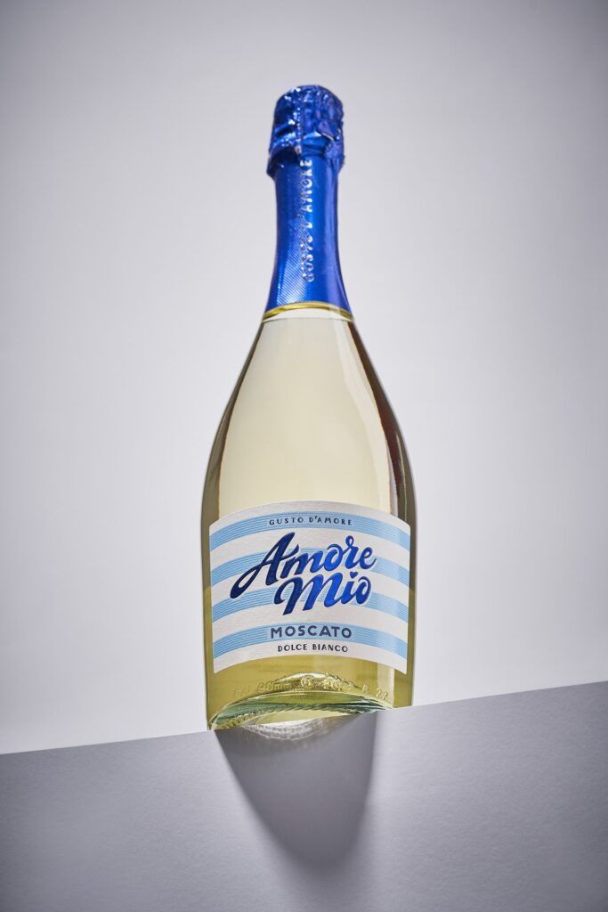
The challenge was to create a visual identity that could capture this spirit without losing sight of commercial realities. The solution is a design system that is both structured and playful, a rare balance that ensures clarity on the shelf while evoking the carefree rhythms of Mediterranean summers. At its core lies bold colour differentiation, a strategy that not only enhances visibility but also mirrors the kaleidoscopic palette of seaside holidays. Each variant in the range carries its own distinctive hue, inviting consumers to explore the line with ease and delight.
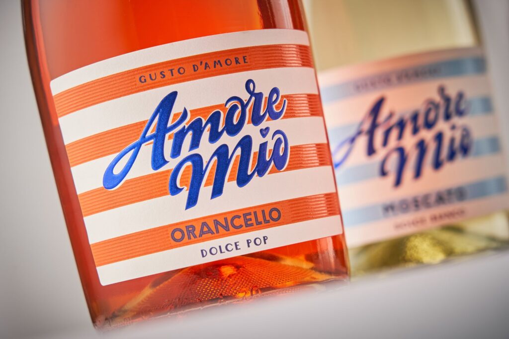
The inspiration is unmistakably Italian. The rhythmic striping that defines the packaging draws directly from the Amalfi Coast, where beach umbrellas and deck chairs create a visual symphony of stripes against the azure sea. These patterns are more than decorative—they are cultural shorthand for leisure, conviviality, and the timeless pleasures of sun-drenched afternoons. By weaving this imagery into its identity, Amore Mio taps into a collective imagination of holidays and shared moments, offering consumers not just a drink but an escape.
Typography, too, plays a central role in shaping the brand’s personality. Expressive yet disciplined, the chosen typefaces strike a balance between exuberance and clarity. They command attention without overwhelming, ensuring that the brand name and product details remain legible and memorable. This typographic approach reinforces the structured playfulness of the overall design, guiding the eye while leaving space for emotional resonance. The disciplined layout ensures cohesion across the range, building recognition and trust in a crowded retail environment.
Shelf presence is the battleground for ready-to-drink cocktails, and Amore Mio’s identity has been engineered to win. The bold colours and rhythmic striping create instant differentiation, drawing the eye even amidst the noise of competing brands. Yet the design avoids gimmickry, maintaining a sense of quality that reassures consumers they are choosing a product that delivers both style and substance. This balance between accessibility and perceived quality is central to Amore Mio’s positioning. It is a brand that invites everyone to indulge in the pleasures of summer cocktails, without compromising on standards.
The result is a visual identity that communicates rather than merely decorates. It tells a story of summer energy, of Mediterranean leisure, of joy structured into rhythm. It conveys that Amore Mio is not simply a drink but a lifestyle choice, a companion for moments of celebration and relaxation. In doing so, it aligns with a broader trend in beverage branding, where emotional connection and cultural storytelling are as vital as taste and price.
Amore Mio’s launch underscores the growing recognition that design is a powerful commercial tool. In a market where consumers are bombarded with options, clarity and memorability are invaluable. By investing in a design system that is distinctive yet cohesive, Amore Mio ensures its products are not only noticed but remembered. This effectiveness is amplified by the brand’s ability to evoke cultural references that resonate across demographics, making it relevant to both seasoned wine drinkers and younger audiences seeking accessible sophistication.
Ultimately, Amore Mio’s identity is a celebration of contrasts: bold yet disciplined, playful yet structured, accessible yet premium. It understands the emotional drivers of its audience and translates them into a visual language that is clear, memorable, and effective. In doing so, it sets a new benchmark for ready-to-drink cocktails, proving that design can be as intoxicating as the drink itself.
As the line makes its way onto shelves, Amore Mio invites consumers to embrace the spirit of summer, to indulge in the dolce vita, and to discover a cocktail experience that is as visually delightful as it is refreshing. In a marketplace where identity often determines destiny, Amore Mio has crafted a story that feels destined to endure.
Discover more from Creative Brands
Subscribe to get the latest posts sent to your email.


