
Sorted Branding has unveiled a striking new identity for 30ML, a modern beverage brand, with packaging that blends bold colour, clean typography, and strategic design for instant shelf impact. The system ensures clarity, scalability, and consistency, positioning 30ML as a confident, contemporary player ready to expand in a competitive market.
In the crowded and fast-moving beverage sector, where shelf presence can make or break a brand, 30ML has emerged with a refreshed identity that speaks directly to modern consumers. The transformation, led by Sorted Branding, is built on a foundation of clarity, confidence, and boldness, ensuring that every detail of the packaging and design system contributes to instant recognition and long-term brand loyalty.
From the outset, the project was approached with a strategic mindset. Sorted Branding recognised that 30ML’s positioning demanded more than just aesthetic appeal; it required a system that could embody freshness, precision, and bold flavour while remaining adaptable to future growth. The result is a comprehensive design language that balances minimalism with character, ensuring that the brand feels contemporary and distinctive in a competitive marketplace.
At the heart of the new identity lies a logo that captures the essence of 30ML with striking clarity. It is simple yet assertive, reflecting the brand’s name with a sense of confidence that resonates across packaging and digital platforms. Typography was chosen with meticulous care, ensuring modernity and precision while retaining readability across contexts. This typographic discipline not only enhances the brand’s professional edge but also ensures that consumers can quickly and easily engage with the product information.
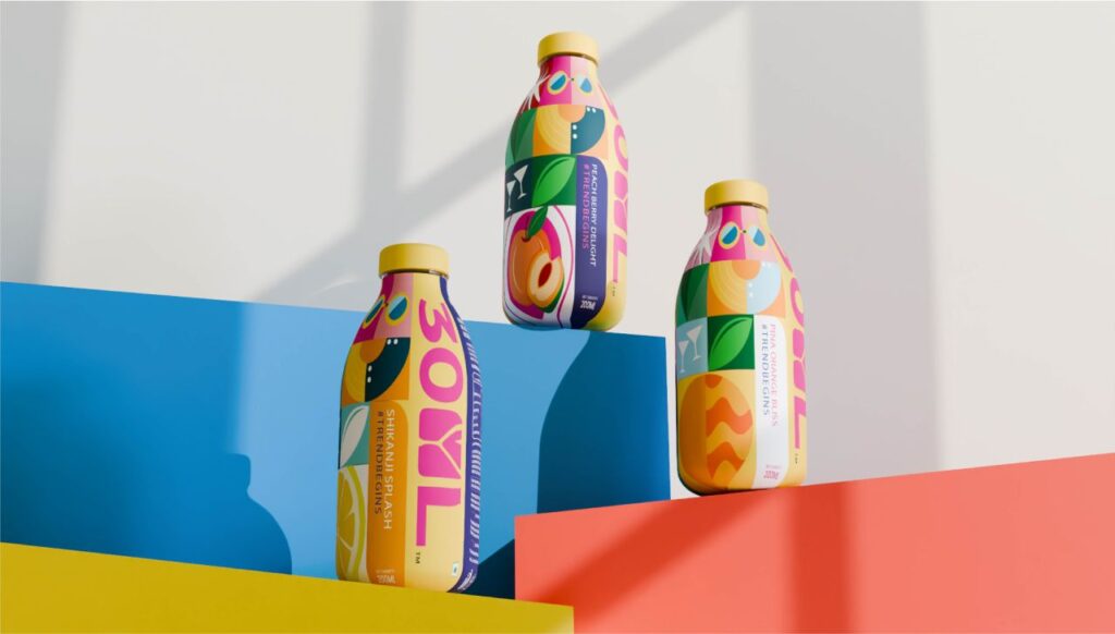
Colour plays a central role in the refreshed identity. Sorted Branding developed a vibrant yet refined palette designed to express energy and freshness. The colours are bold enough to command attention on crowded shelves, yet sophisticated enough to convey a sense of quality and refinement. This balance ensures that 30ML’s packaging is not only eye-catching but also memorable, creating a strong visual association that consumers can recall instantly.
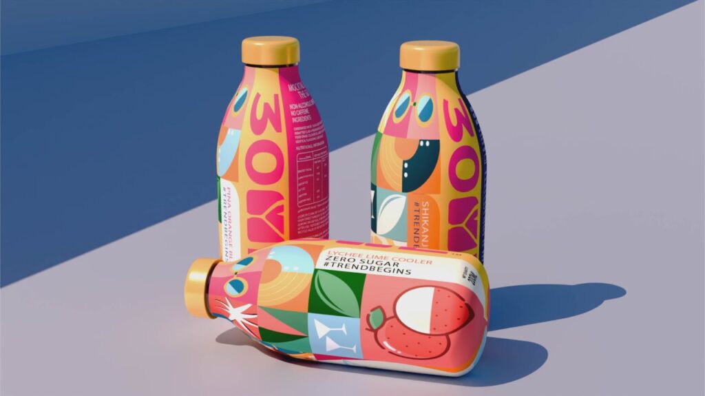
The packaging design itself was crafted with shelf presence as the guiding principle. Clean layouts, bold colour blocking, and clear visual cues were integrated to maximise visibility and consumer recall. Each element, from the hierarchy of information to the placement of flavour indicators, was carefully structured to enhance clarity and strengthen recognition. This attention to detail ensures that the product stands out in retail environments, while also making it easy for consumers to navigate the range.
Consistency across SKUs was another critical consideration. The design system ensures that each variant of 30ML maintains a cohesive brand language, allowing for scalability without sacrificing identity. Whether introducing new flavours, limited editions, or digital extensions, the framework provides a unified visual foundation that reinforces the brand’s bold and modern personality. This adaptability positions 30ML for confident expansion, ensuring that future innovations remain anchored in the brand’s core identity.
Beyond aesthetics, the system reflects a deep understanding of consumer behaviour and market dynamics. In an era where shoppers are bombarded with choices, clarity and instant recognition are invaluable. By prioritising legibility, colour impact, and structured layouts, Sorted Branding has created packaging that not only attracts attention but also builds trust and loyalty. Consumers are more likely to return to a brand that feels consistent, reliable, and easy to engage with, and 30ML’s new identity delivers precisely that.
The project also underscores the importance of aligning design with brand personality. 30ML’s identity is contemporary and confident, qualities that resonate with a generation of consumers seeking products that reflect their own sense of style and individuality. The packaging communicates these values without resorting to gimmicks, relying instead on precision, boldness, and clarity to make its mark.
For Sorted Branding, the collaboration with 30ML represents a case study in how strategic design can elevate a brand beyond its immediate product offering. By creating a cohesive, memorable, and scalable foundation, the agency has positioned 30ML as a standout player in the beverage market. The identity is not only visually compelling but also structurally sound, capable of supporting growth and adaptation in a rapidly evolving industry.
The impact of the redesign is already evident in the way 30ML presents itself. On shelves, the packaging commands attention with its vibrant colours and clean typography. Online, the identity translates seamlessly across digital platforms, ensuring consistency in consumer experience. In promotional assets, the unified framework reinforces the brand’s bold personality, creating a holistic presence that strengthens recognition and recall.
Ultimately, the refreshed identity is more than just a design exercise; it is a strategic investment in the brand’s future. By sharpening its packaging with vibrant colour and typographic precision, 30ML has secured a place in the minds of consumers and carved out a distinctive position in the beverage landscape. The brand is now equipped not only to capture attention but also to build loyalty and expand with confidence.
Sorted Branding’s work with 30ML demonstrates the power of design to shape perception and drive growth. In a market where first impressions are critical, the agency has delivered an identity that is fresh, precise, and bold – qualities that ensure 30ML will continue to stand out, resonate with consumers, and thrive in the years ahead.
Discover more from Creative Brands
Subscribe to get the latest posts sent to your email.


