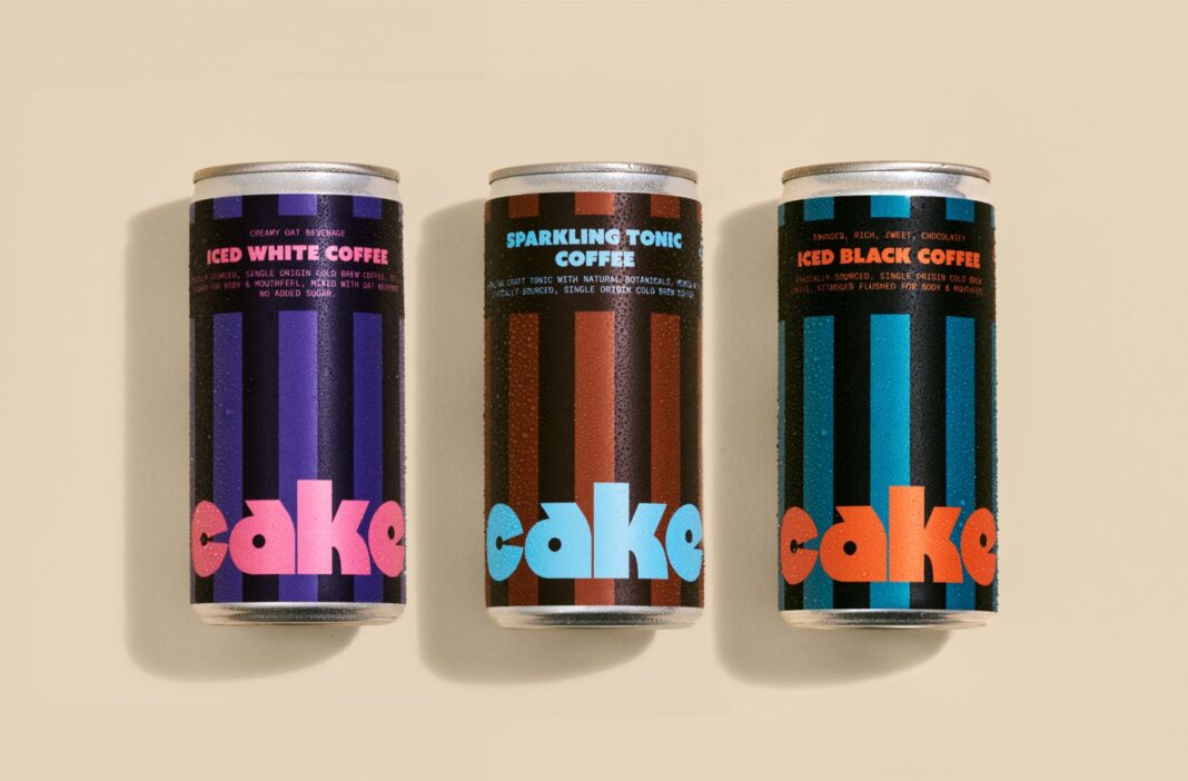
CAKE Coffee’s entry into the ready-to-drink market defies convention with packaging that bursts with energy and optimism. Designed by Daniel Ting Chong and Jordan Metcalf, the cans feature vibrant stripes and playful typography, creating a pop art-inspired identity that is instantly recognizable, culturally resonant, and unapologetically bold.
In a category where muted palettes and restrained tones have long dictated the visual language, CAKE Coffee has chosen to chart a different course. Its debut in the ready-to-drink market arrives not with quiet understatement but with a packaging identity that insists on being noticed. The collaboration between designers Daniel Ting Chong and Jordan Metcalf has yielded a system that is as expressive as it is structured, a rare balance in a space often dominated by minimalism and seriousness.
The cans themselves are a study in rhythm and contrast. Wide vertical stripes climb the surface, creating a sense of upward momentum and framing a logotype that is oversized, bubbly, and unapologetically playful. Each flavor is distinguished by a shift in high-contrast color, ensuring clarity while maintaining the brand’s exuberant personality. The design draws heavily from pop art, a movement that celebrated everyday objects with bold colors and graphic intensity, and in doing so, CAKE Coffee situates itself within a lineage of cultural optimism.

What makes this identity particularly striking is its refusal to blend in. In supermarkets and convenience stores, ready-to-drink coffee often leans toward muted browns, blacks, and greys, signaling seriousness and sophistication. CAKE Coffee, by contrast, embraces brightness and energy, positioning itself as a brand that is not only about caffeine but also about joy, rhythm, and cultural relevance. The packaging becomes more than a vessel; it is a statement of intent, a declaration that coffee can be fun, expressive, and visually engaging.
The typography plays a crucial role in grounding this exuberance. While the logotype is bubbly and oversized, the supporting type system is structured and precise, ensuring that the overall design does not tip into chaos. This balance between playfulness and clarity reflects the dual nature of the product itself: coffee as both a source of energy and a ritual of focus. The designers have managed to capture this duality in a way that feels fresh yet coherent, bold yet disciplined.
For Daniel Ting Chong and Jordan Metcalf, the challenge was not simply to create something eye-catching but to craft an identity that could sustain recognition across flavors and formats. The vertical stripes provide a consistent rhythm, while the shifting color palettes allow for differentiation. This system ensures that the brand remains instantly recognizable on shelf, even as it expands its range. It is a clever solution to the perennial problem of brand consistency versus product variety.
The cultural resonance of the design cannot be overstated. Pop art, with its roots in celebrating mass culture, provides a fitting framework for a product that seeks to democratize coffee consumption. By drawing on this visual language, CAKE Coffee aligns itself with a tradition of accessibility and optimism. The packaging does not speak in hushed tones of exclusivity; instead, it invites consumers into a world of color, energy, and shared cultural references. In doing so, it positions itself as a brand that is not only selling coffee but also participating in a broader cultural conversation.
The impact of such a design strategy extends beyond aesthetics. In a crowded market, shelf presence is critical, and CAKE Coffee’s packaging ensures that it cannot be overlooked. The bold stripes and oversized logotype create immediate visual impact, while the clarity of flavor differentiation aids consumer decision-making. This combination of impact and clarity is rare, and it speaks to the designers’ ability to balance expressive creativity with functional design.
Moreover, the packaging identity reflects a confidence that is essential for new entrants in competitive categories. By refusing to conform to established norms, CAKE Coffee signals that it is not merely another player but a brand with a distinct point of view. This confidence is communicated not only through the bold visuals but also through the coherence of the system, which suggests careful thought and deliberate strategy.
As ready-to-drink coffee continues to grow in popularity, brands are increasingly seeking ways to stand out. CAKE Coffee’s approach demonstrates that differentiation need not come at the expense of clarity. By embracing pop art influences, structured typography, and a bold color system, the brand has created an identity that is both expressive and functional. It is a reminder that design can be a powerful tool in shaping consumer perception, and that packaging is often the first—and most lasting—touchpoint between brand and consumer.

In the end, CAKE Coffee’s packaging is more than a visual identity; it is a cultural statement. It challenges the conventions of its category, celebrates energy and optimism, and delivers impact with clarity and confidence. For consumers, it offers not just a drink but an experience, one that begins the moment they spot the can on the shelf. And for the brand, it establishes a foundation of recognition and resonance that will serve it well as it seeks to carve out its place in the market.
Discover more from Creative Brands
Subscribe to get the latest posts sent to your email.


