
International creative agency Kontrapunkt unveils Kontrapunkt Type, its first retail type foundry. Built on four decades of designing custom typefaces for global brands, the launch introduces three foundational families—KP Duo Sans, KP Duo Serif, and KP Spatial—bringing their typographic expertise to a wider audience.
For forty years, Kontrapunkt has been quietly shaping the way the world reads brands. From LEGO’s playful clarity to Carlsberg’s timeless brew, from noma’s culinary minimalism to Shiseido’s refined elegance, the international creative agency has built typefaces that do more than spell words—they embody identities. Now, in a decisive move that bridges its legacy with a broader audience, Kontrapunkt has launched Kontrapunkt Type, its first-ever retail type foundry. For the first time, the studio’s typographic craft, once reserved for bespoke commissions, is available to the public.
The announcement marks a turning point in the studio’s journey. Kontrapunkt has long been known for its ability to design type systems that transcend borders, industries, and cultures. Their work with Mitsubishi, Nissan, Chamberlain Coffee, and ASICS Tiger has demonstrated how typography can be both universal and deeply personal, tailored to the voice of each brand. Yet until now, this expertise was locked within collaborations. By opening a retail foundry, Kontrapunkt is amplifying its craft, offering foundational typefaces designed for everyone—from designers and publishers to brands seeking a distinctive yet versatile typographic voice.
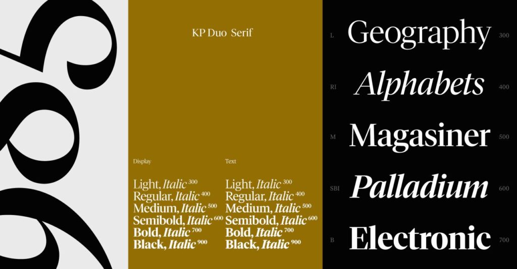
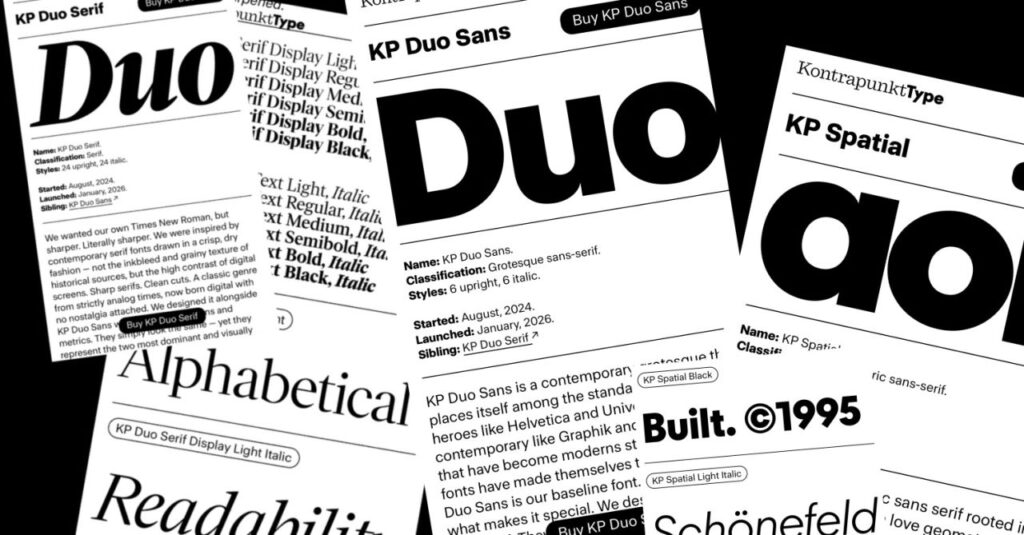
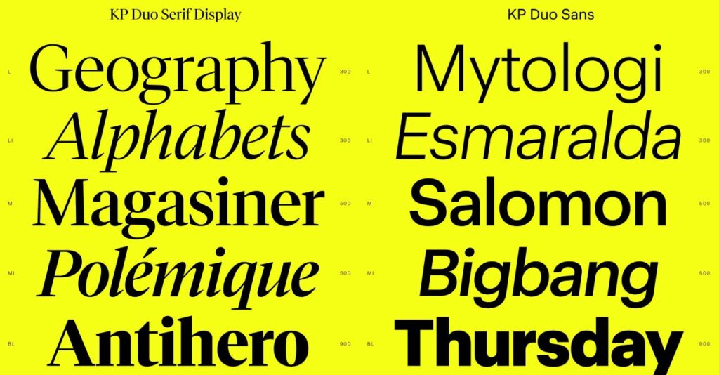
The debut collection is deliberately modest in scale but ambitious in intent: three typeface families that reflect Kontrapunkt’s philosophy of clarity, warmth, and adaptability. KP Duo Sans and KP Duo Serif are conceived as siblings, sharing proportions and metrics but diverging in genre. KP Duo Sans is a contemporary grotesque, balancing digital precision with subtle warmth. It is designed to feel approachable yet exact, a font that can carry the weight of modern communication without losing humanity. KP Duo Serif, by contrast, is a transitional serif crafted for screens rather than print. Crisp, high-contrast, and free from the inkbleed of traditional serifs, it embodies how typography must evolve for digital contexts. Together, the Duo family offers designers a toolkit of harmony and contrast, enabling seamless shifts between sans and serif without disrupting rhythm.
The third family, KP Spatial, is a geometric sans that reimagines geometry for modern use. Where many geometric fonts risk cold perfection, KP Spatial introduces circular warmth and triangular sharpness, creating a balance of beauty and readability. It is designed to be legible at any size, whether in the intimacy of mobile screens or the grandeur of architectural signage. In essence, KP Spatial is geometry rebuilt for human communication, a font that acknowledges both aesthetic appeal and functional clarity.
For Kontrapunkt, these typefaces are not just products—they are an invitation. Typography has always been the invisible architecture of communication, shaping how words are perceived before they are understood. By releasing retail fonts, the studio is democratizing access to its expertise, allowing individuals and organizations to harness the same typographic precision that global brands have relied on for decades. It is a move that reflects both confidence in their craft and recognition of the growing demand for typefaces that are versatile, culturally sensitive, and digitally optimized.
The timing of the launch is significant. In an era where design is increasingly global, typography must navigate multiple languages, scripts, and cultural contexts. Kontrapunkt’s history of working across industries and geographies positions them uniquely to address this challenge. Their typefaces are not merely aesthetic choices but systems designed to function across diverse environments. By making these systems available to the public, Kontrapunkt is contributing to a broader conversation about accessibility and inclusivity in design.
There is also a cultural resonance to the launch. Typography has often been seen as the preserve of specialists, a craft hidden behind the logos and wordmarks of major brands. Kontrapunkt Type challenges that perception, presenting typefaces as foundational tools for everyone. In doing so, the studio is aligning with a broader movement in design—one that values openness, collaboration, and shared resources. Just as open-source software transformed technology, retail type foundries like Kontrapunkt Type have the potential to transform visual communication, making high-quality typography more widely available.
The launch also underscores the evolving role of creative agencies. No longer confined to client commissions, agencies are increasingly creating products that extend their influence beyond individual projects. For Kontrapunkt, the foundry is both a business expansion and a statement of identity. It signals that their expertise is not only service-based but also generative, capable of producing assets that shape the design landscape at large. In this sense, Kontrapunkt Type is as much about legacy as it is about innovation—a way of ensuring that the studio’s typographic vision continues to resonate in contexts they may never directly touch.
As the first collection enters the market, the response from designers will be telling. KP Duo Sans and Serif offer a rare combination of harmony and contrast, while KP Spatial promises geometric clarity with human warmth. Together, they provide a foundation that is both practical and expressive. For those who have admired Kontrapunkt’s work from afar, the foundry offers a chance to engage directly with their craft. For the studio itself, it represents a new chapter—one that builds on four decades of expertise while opening doors to new audiences.
In the end, Kontrapunkt Type is more than a retail venture. It is a declaration that typography matters, that the shapes of letters carry voices, identities, and cultures. By making their typefaces available to all, Kontrapunkt is not just selling fonts; they are sharing a philosophy of design that has guided them for forty years. And in doing so, they remind us that every word we read is also a work of art.
Discover more from Creative Brands
Subscribe to get the latest posts sent to your email.


