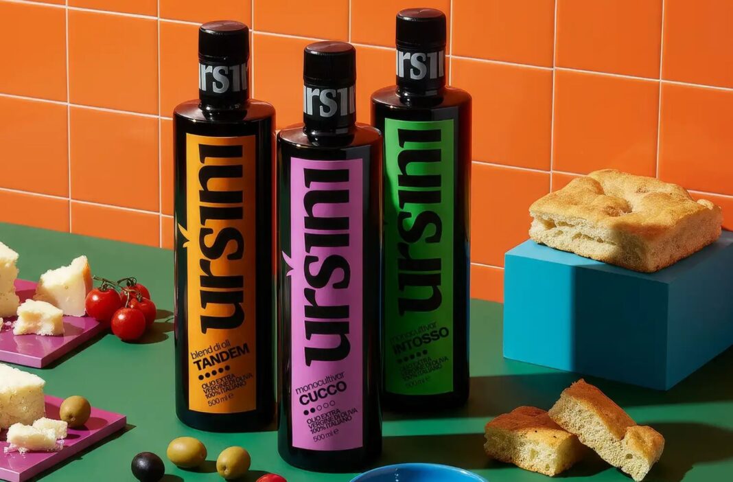
Italian olive oil and preserved foods brand Ursini has unveiled a redefined visual identity and packaging system that places its historic name at the centre. A modular, colour-led label architecture balances heritage and modern shelf presence, creating clarity, consistency and stronger recognition across an expansive artisan product range.
In a category crowded with rustic illustrations, script fonts and pastoral nostalgia, standing out without shouting has become one of the most delicate challenges for heritage food brands. For Ursini, a historic Italian producer of high-quality olive oils and preserved specialities, the task was not to reinvent itself but to rediscover how to be unmistakably itself in a modern retail environment.
Founded on generations of craftsmanship and culinary expertise, Ursini’s reputation has long been tied to quality, provenance and tradition. Yet as the artisanal food market has expanded and retail shelves have grown more visually competitive, the brand’s previous packaging struggled to assert the authority of its name across an increasingly broad range of products. The problem was not authenticity, but visibility. In a sea of similarly styled artisan labels, Ursini risked blending into the background.
The brand’s redesign addresses a fundamental question faced by many legacy producers: how can a historic name become the most powerful graphic asset without losing the warmth and integrity that made it meaningful in the first place?
The answer lies in a system that makes the Ursini name the dominant visual anchor across every product. Rather than treating the brand as a secondary element behind illustrations, product descriptors or decorative flourishes, the new identity elevates “Ursini” to the centre of the visual experience. It is consistently scaled for legibility and recognition, becoming the first thing shoppers see, regardless of the SKU or category.
This shift is deceptively simple but strategically significant. By allowing the brand name to lead, Ursini moves away from competing through ornamental storytelling and instead competes through confidence. The packaging no longer asks to be interpreted; it declares its presence with clarity.
To support this, a modular label structure has been introduced, built around bold, differentiated colour fields. These colours serve as flexible signposts across the product range, allowing each SKU to communicate its specific identity while maintaining an unmistakable connection to the master brand. Olive oils, preserved vegetables, sauces and other specialities can now sit together as a cohesive family without appearing repetitive or indistinct.
The modularity of the system is crucial. It creates a framework where hierarchy remains constant — the Ursini name always occupies the same commanding role — while other elements such as product information, ingredients and descriptors can adapt to the needs of each item. This ensures clarity for consumers navigating the shelf while allowing the brand to accommodate an expansive and evolving portfolio.
Colour, in this context, becomes more than a decorative choice. It is an organising principle. Each bold field acts as a visual cue, helping shoppers quickly differentiate between varieties while reinforcing the consistency of the overall design. The result is a packaging system that feels both structured and alive, capable of expressing variety without sacrificing unity.
Importantly, the redesign does not discard Ursini’s heritage. Instead, it reframes it. The emphasis on the brand name honours the legacy built over generations, acknowledging that the story of Ursini itself is more powerful than any illustration of olive groves or Tuscan hills. The craftsmanship and culinary authority remain embedded in the identity, but they are communicated through restraint rather than embellishment.
This approach reflects a broader shift in how contemporary consumers engage with premium food brands. Shoppers increasingly seek clarity, authenticity and trust signals that can be understood at a glance. Overly ornate designs, once synonymous with tradition, can now obscure the very qualities they aim to convey. Ursini’s new identity recognises that heritage today is best expressed through confidence and simplicity.
On shelf, the impact is immediate. Where previous packaging might have competed with neighbouring products for attention through visual noise, the new Ursini range commands space through composure. The bold scale of the brand name, combined with the disciplined colour architecture, creates a strong visual block that is easy to recognise from a distance and memorable after a single encounter.
For retailers, this coherence offers practical benefits as well. The system ensures that as the range expands, the brand presence does not dilute. New products can be integrated seamlessly without requiring entirely new design solutions, maintaining consistency across categories and formats.
For consumers, the experience becomes more intuitive. Navigating the range no longer requires careful reading of labels to understand relationships between products. The visual system itself communicates belonging and hierarchy, allowing shoppers to trust that every item bearing the Ursini name adheres to the same standards of quality and craftsmanship.
Ultimately, the redesign demonstrates that packaging can function as both a heritage statement and a contemporary retail tool. By making the brand name the hero and building a flexible yet disciplined visual structure around it, Ursini has created an identity that feels timeless rather than nostalgic.
In doing so, Ursini offers a lesson for many artisan producers grappling with similar challenges. In markets saturated with visual storytelling, sometimes the most powerful story is simply the name that has stood the test of time.
Discover more from Creative Brands
Subscribe to get the latest posts sent to your email.


