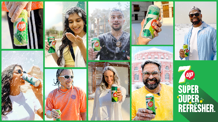
7UP’s latest summer campaign turns up the chill with snowburst visuals and fast-paced everyday scenes, spotlighting its ₹20, 400 ml pack. Anchored in the ‘Super Duper Refresher’ promise, the brand blends extreme cooling imagery with affordability, proving that instant refreshment and value can go hand in hand during peak heat.
As summer tightens its grip and thermometers edge relentlessly upward, the craving for relief becomes universal. Streets shimmer in the heat haze, bus stops feel like furnaces, and everyday routines slow under the weight of the sun. It is in this familiar seasonal struggle that 7UP arrives with an unexpected promise: not just refreshment, but an instant, almost cinematic chill that seems to defy the weather itself.
In its latest campaign, 7UP transforms the sensory experience of summer by bringing snow into the heart of sweltering everyday life. Through striking “snowburst” visuals, the brand reimagines what refreshment can look and feel like. The imagery is sharp, fast, and dramatic. A cap twists open, and instead of fizz alone, a burst of icy white coolness engulfs the frame. Frost creeps across surfaces. Heat dissolves into a visual blizzard. The ordinary act of taking a sip becomes a moment of exaggerated, almost surreal relief.
But this is not merely a spectacle of special effects. The snowburst is a metaphor for how 7UP wants consumers to feel in peak summer: an immediate, overwhelming sense of cool that cuts through the discomfort of heat. It is refreshment amplified, dramatized, and delivered with speed. The campaign’s fast-paced scenes capture everyday moments that viewers instantly recognise — waiting for a bus, walking under the harsh sun, sitting in a crowded room — only to be dramatically transformed by the entry of 7UP’s chill factor.
Central to this narrative is the brand’s enduring positioning as the ‘Super Duper Refresher.’ Over the years, 7UP has leaned into its reputation for crisp, lemon-lime refreshment, but this campaign takes that promise to a new visual and emotional extreme. The cooling is not subtle; it is bold, theatrical, and impossible to ignore. The campaign suggests that one sip does not merely quench thirst — it flips the environment from scorching to snowy in an instant.
Yet what gives the campaign additional weight is not just the creative spectacle, but the sharp value cue embedded within it. At the heart of the story is the ₹20, 400 ml pack, a reminder that this heightened experience of refreshment is within easy reach. In a market where rising costs often make indulgence feel expensive, 7UP positions its offering as an affordable antidote to the heat. The message is clear: beating the summer does not require spending more.
The inclusion of the price point is not an afterthought but a strategic anchor. As the snowburst visuals grab attention and the ‘Super Duper Refresher’ line reinforces brand memory, the ₹20 pack grounds the campaign in everyday reality. It speaks directly to students, workers, commuters, and families looking for simple, accessible relief. The promise of chill is backed by the promise of value.
The pacing of the campaign mirrors the urgency of summer itself. Quick cuts, rapid transitions, and energetic scenes reflect how people move through hot days seeking moments of respite. The storytelling does not linger; it rushes forward, just as people hurry to escape the sun. Each scene builds toward the release that comes with opening a bottle of 7UP, making the act feel both necessary and rewarding.
Visually, the contrast between heat and snow becomes the campaign’s defining language. Sun-drenched streets are interrupted by blasts of white frost. Warm tones give way to icy hues. The transformation is immediate and striking, reinforcing the idea that relief from heat can be just as quick. This dramatic shift ensures that the campaign remains memorable, standing out in the crowded landscape of summer advertising where “cool” is often promised but rarely visualised so vividly.
The everyday settings chosen for the campaign add relatability to the high-impact visuals. These are not exotic locations or stylised environments but familiar scenes drawn from daily life. By placing extraordinary chill within ordinary contexts, 7UP bridges imagination and reality. Viewers can easily picture themselves in those moments, reaching for the same bottle to experience the same burst of relief.
At a deeper level, the campaign taps into a universal emotional truth of summer: the longing for instant comfort. Whether it is stepping into shade, turning on a fan, or sipping a cold drink, people seek quick solutions to escape the heat. 7UP positions itself as one such solution — immediate, effective, and satisfying. The snowburst becomes a visual shorthand for that emotional payoff.
The emphasis on affordability also reflects a broader understanding of consumer behaviour. Summer is a season of frequent beverage consumption, and value matters when purchases are repeated daily. By spotlighting the ₹20, 400 ml pack, 7UP aligns refreshment with smart spending, making the choice feel both pleasurable and practical.
In blending dramatic cooling imagery with everyday value, the campaign strikes a balance between aspiration and accessibility. It excites the senses while reassuring the wallet. The promise is not just that 7UP will refresh you, but that it will do so without stretching your budget.
As temperatures continue to climb, 7UP’s message cuts through with clarity: relief is just a sip away. With snowburst visuals, rapid storytelling, and a sharp value proposition, the brand turns the narrative of summer on its head. Instead of enduring the heat, consumers are invited to imagine — and experience — a sudden, exhilarating chill.
In doing so, 7UP redefines what it means to be refreshed in summer. It is no longer just about cooling down; it is about flipping the script on heat entirely. And at ₹20 for 400 ml, that icy escape feels closer than ever.
Discover more from Creative Brands
Subscribe to get the latest posts sent to your email.


