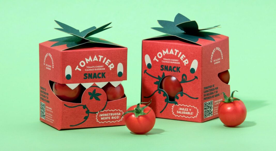
Meteorito’s Tomatier Snack for Nijasol and Carrefour reimagines cherry tomatoes as a fun, child-friendly snack without compromising parental trust. With a friendly monster identity, die-cut “mouth” windows, and a tomato stem closure, the packaging transforms fresh produce into an engaging, high-impact shelf experience rooted in clarity and quality.
In supermarket aisles where sugary treats and processed snacks compete relentlessly for children’s attention, a humble cherry tomato has rarely stood a chance. Meteorito’s latest packaging design for Nijasol and Carrefour aims to change that narrative. With Tomatier Snack, tomatoes are no longer positioned as a reluctant health choice but as an exciting, playful snack that children can reach for willingly and parents can approve of without hesitation.
Tomatier Snack is a special edition packaging concept developed as an extension of the Tomatier range, created to reframe how fresh produce is perceived in retail environments. The design challenge was deceptively complex: how do you transform a natural, everyday product into something that competes visually and emotionally with confectionery, without losing the integrity and clarity that parents expect from fresh food?
Meteorito’s answer lies in storytelling through design. At the heart of the identity is a friendly monster character that becomes the face of the Tomatier Snack experience. Rather than relying on conventional cues associated with freshness and health, the packaging embraces bold colour, expressive illustration and a sense of personality rarely seen in fruit and vegetable aisles. The monster is not just a decorative element but the driver of the entire visual system, creating a narrative that children can immediately connect with.
The most distinctive feature of the packaging is its die-cut window shaped like an expressive mouth. Through this playful opening, the cherry tomatoes are revealed, appearing almost as if they are inside the character itself. This simple yet clever device serves multiple purposes. It invites curiosity, creates a moment of delight, and most importantly, offers transparency. Parents can see the product clearly, reinforcing trust in quality and freshness while children engage with what feels like a character-driven snack.
Functionality has been given equal importance. The closure of the box is inspired by the shape of a tomato stem, blending character and practicality into one design element. It not only secures the contents but reinforces the product’s identity, making the packaging itself feel like an extension of the tomato rather than an external container. This attention to detail ensures that the experience remains coherent from shelf to snack time.
Bold colours and dynamic illustration further distinguish Tomatier Snack from its surroundings. In a category often dominated by muted tones and straightforward photography, the pack stands out instantly. It transforms what would typically be a simple produce box into something closer to a toy-like object or collectable, encouraging children to interact with it even before they open it. The result is a strong shelf impact in an aisle not usually associated with visual excitement.
Yet, while the design is playful, it never loses sight of its responsibility to reassure parents. The clarity of the window, the honest display of the product, and the structured, tidy format of the box signal quality and care. The packaging avoids clutter and excessive messaging, allowing the design to communicate freshness and trust implicitly. This balance between fun and credibility is what makes Tomatier Snack particularly effective.
The project also reflects a broader shift in how brands are beginning to approach healthy food for children. Instead of framing fruits and vegetables as virtuous alternatives to “real” snacks, Tomatier Snack positions cherry tomatoes as a snack in their own right. It acknowledges that children are drawn to stories, characters and colour, and uses those elements without resorting to gimmicks or artificial cues.
For Nijasol and Carrefour, this packaging serves as both a brand extension and a strategic retail tool. It creates differentiation within the Tomatier range while attracting new attention from families browsing the produce section. The snack format and engaging design make it suitable for lunchboxes, after-school bites and on-the-go consumption, subtly shifting tomatoes into contexts traditionally occupied by packaged snacks.
Meteorito’s design demonstrates how packaging can alter perception without changing the product itself. By rethinking how cherry tomatoes are presented, the studio has elevated their status from ingredient to experience. The monster character, the die-cut mouth, and the stem-inspired closure work together to create an emotional connection that goes beyond functionality.
Importantly, Tomatier Snack respects the intelligence of both its audiences. Children are given a visual story to enjoy, while parents are offered clarity and confidence. Neither is compromised for the other. This dual appeal is what allows the packaging to function as both a playful object and a trustworthy food container.
In an era where packaging is increasingly seen as a storytelling medium, Tomatier Snack stands as an example of how design can drive behaviour change in subtle ways. It encourages children to see tomatoes not as something they are told to eat, but as something they want to eat. At the same time, it reinforces the idea that healthy choices do not have to be boring or didactic.
What Meteorito has achieved is more than an attractive box. It is a reimagining of how fresh produce can compete in a visual culture dominated by processed food branding. By borrowing the language of snacks and applying it to a natural product, Tomatier Snack bridges the gap between fun and freshness.
As supermarkets continue to search for ways to make healthy food more appealing to younger consumers, designs like Tomatier Snack may well point the way forward. A cherry tomato, after all, has always had the potential to be a snack. It just needed the right character to tell its story.
Discover more from Creative Brands
Subscribe to get the latest posts sent to your email.


