
Carlton Collection has unveiled a striking new brand identity crafted by creative agency D8, designed to unify its diverse portfolio of hotels and hospitality destinations while celebrating individuality, local character and connection. The rebrand introduces a bespoke wordmark, vibrant colour palette and a fresh loyalty programme to inspire exploration.
Carlton Collection, a family of hotels and hospitality destinations that includes two DesignHotels™, has announced a comprehensive rebrand that marks a pivotal moment in its evolution. The transformation, led by strategic creative agency D8, is intended to unify the group’s diverse portfolio under one cohesive identity while amplifying the unique character of each property. With a bold new visual language, a bespoke wordmark and a cut-through colour palette, the Carlton Collection is positioning itself as a distinctive family of destinations that encourages exploration and celebrates individuality.
For years, the Carlton Collection operated as a group of independent hotels, each with its own personality but lacking a visible connection to the wider brand. Rosie Street, Managing Director of D8 in Amsterdam, explained the challenge: “The Carlton Collection’s biggest challenge was that it didn’t exist as a brand in the consumer’s consciousness. Each hotel operated independently, with no visible connection to the broader collection. The rebrand has unified these diverse properties under one identity, helping the central team shift from simply selling rooms to promoting the value of the wider collection. This change not only strengthens the brand but also creates new opportunities for growth.”
The new identity is designed to amplify the collective strength of the group while celebrating individuality, local character and colour. In a deliberate move, the word ‘hotel’ has been removed from the name, signalling a broader vision that encompasses restaurants, bars and experiences beyond accommodation. This shift reflects the evolving expectations of modern travellers, who increasingly seek authenticity, connection and memorable experiences rather than just a place to stay.
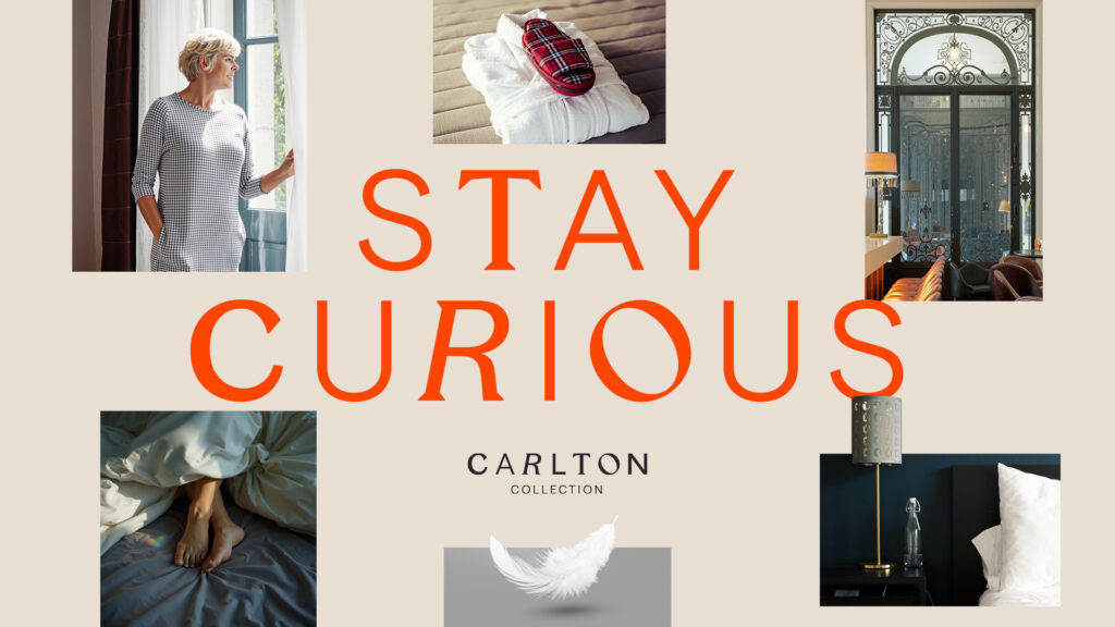
Visually, the rebrand is striking. The logo features individually crafted characters, each unique yet harmonious, symbolising the distinctiveness of every property within the collection. This design approach extends to a bespoke typographic treatment for headline messaging, ensuring that all communications carry a sense of personality and playfulness. The colour palette, anchored by a warm blue and a vibrant orange, provides consistency and cut-through while allowing flexibility across different applications. Together, these elements create a brand identity that is both cohesive and eclectic, mirroring the Carlton Collection’s diverse portfolio.
The concept of ‘family’ has become central to the rebrand, influencing everything from tone of voice to internal culture. This theme resonates with the collection’s heritage while aligning with contemporary consumer trends that value authenticity and connection. Andrew Neely, Creative Director at D8, highlighted the philosophy behind the design: “The visual identity is all about celebrating individuality while maintaining harmony. Each character in the wordmarque is distinctly different, yet together they form a cohesive whole, just like the Carlton Collection itself. This approach reflects the eclectic nature of the brand and creates a sense of curiosity and playfulness that draws people in.”
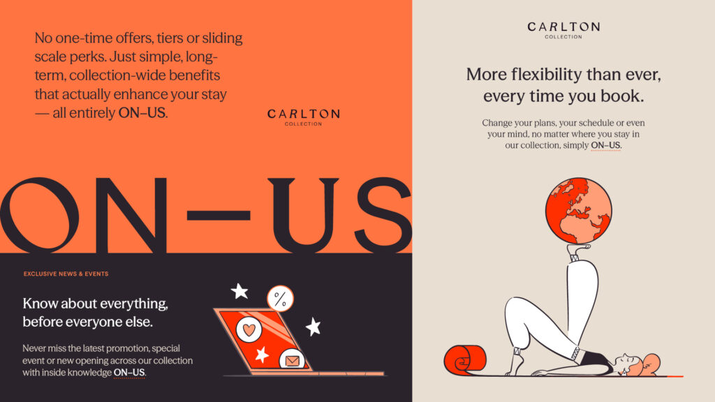
Beyond visual identity, the rebrand introduces a fresh approach to loyalty. D8 has designed ‘ON-US’, a benefits programme that encourages guests to explore the collection. Unlike traditional loyalty schemes that rely on tiers, points or one-time offers, ON-US unlocks flexibility, discounts and special events across every destination. The programme is supported by playful, character-driven illustrations that symbolise the different types of stays, occasions and visitors at Carlton Collection, further reinforcing the celebration of diversity and individuality.
Christa van Camp, Commercial Director at Carlton Collection, emphasised the cultural and strategic impact of the rebrand: “In a world of great diversity, our collection is a celebration of character. We embrace individuality, whether it’s our team members or the hotels and travellers we serve – and are looking forward to bringing this cohesive new vision to our guests through this vibrant rebrand. Working with D8 has helped articulate how we think about the business. The pivotal insight helped align our perspectives and gave us a unifying vision. It allowed us to embrace and amplify our value as a collection, and that shift in thinking has been truly impactful.”
The rollout of the new identity has already begun, with updates to the Carlton Collection’s website and plans to extend the branding into in-room accents that promote the wider family of destinations. This integrated approach ensures that guests encounter the new vision at every touchpoint, reinforcing the sense of belonging to a larger, vibrant community of experiences.
The Carlton Collection’s rebrand is more than a cosmetic change; it represents a strategic repositioning in a competitive hospitality landscape. By unifying its properties under a single identity while celebrating their individuality, the group is carving out a distinctive space that appeals to travellers seeking authenticity, connection and exploration. The bold visual language, innovative loyalty programme and emphasis on family and character signal a confident new chapter for the Carlton Collection, one that promises to inspire curiosity and foster deeper connections with guests.
As the hospitality industry continues to evolve, the Carlton Collection’s rebrand demonstrates the power of design and strategy in shaping perception and driving growth. By embracing individuality within a unified framework, the group has created a brand that is both cohesive and eclectic, resonating with modern travellers and setting the stage for future expansion. For Carlton Collection, the rebrand is not just about aesthetics – it is about redefining what it means to belong to a family of destinations, where every property has its own story, yet together they form a vibrant, connected whole.
Discover more from Creative Brands
Subscribe to get the latest posts sent to your email.


