
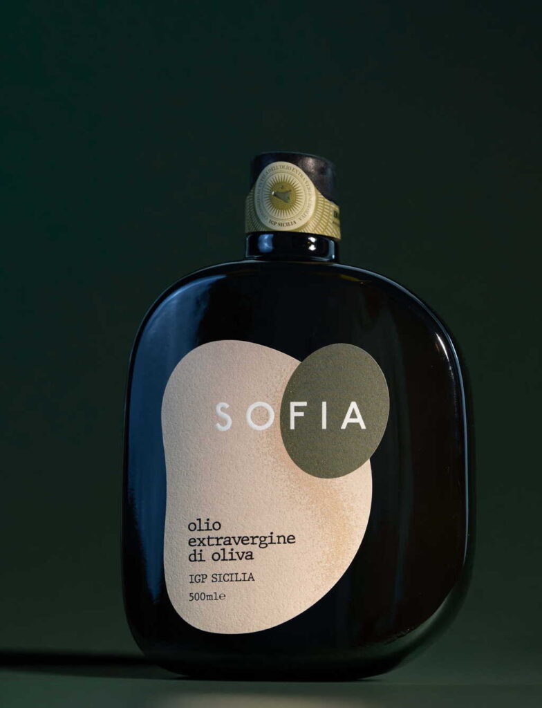
Rosario Lo Iacono Design unveils Sofia, a tactile and intimate extra virgin olive oil label that merges seamlessly with the bottle’s curves. Conceived as a natural extension of the container, Sofia transforms packaging into an emotional dialogue between design and product, redefining how consumers experience olive oil.
In the world of design, where packaging often serves as the first handshake between product and consumer, Rosario Lo Iacono Design has introduced a creation that feels less like a label and more like a living extension of the object it adorns. Sofia, the new extra virgin olive oil label, is not simply a graphic overlay or decorative skin. It is conceived as a tactile, intimate presence that follows the bottle’s curves, enhancing its distinctive shape and completing it in a way that feels both inevitable and revolutionary.
The philosophy behind Sofia is rooted in the idea that design should not be imposed upon an object but should emerge organically from it. In this case, the bottle itself becomes the canvas, and the label is not applied as an external element but as a continuation of the form. The graphics are designed to adapt, to accompany, and to complete the container, creating a continuous dialogue between vessel and design. This approach challenges conventional packaging, which often treats the label as a separate identity, a sticker of branding plastered onto a neutral surface. Instead, Sofia insists that the identity of the product must be inseparable from the physicality of its container.
Rosario Lo Iacono Design has long been known for its sensitivity to materiality and form, and Sofia exemplifies this ethos. The tactile quality of the label invites touch, encouraging consumers to engage with the bottle not only visually but physically. In a marketplace where olive oil brands often compete through ornate graphics, gold foiling, or elaborate typography, Sofia’s intimacy lies in its restraint. It does not shout; it whispers. It does not decorate; it integrates. The result is a product that feels less like a commodity and more like a crafted object, a piece of design that belongs in the hand as much as on the table.
The olive oil industry has always been deeply tied to notions of authenticity, tradition, and sensory experience. From the groves where olives are harvested to the presses that extract their golden liquid, the narrative of olive oil is one of touch, taste, and smell. Sofia’s design mirrors this narrative by emphasizing tactility. The label is not a flat surface but a textured presence that echoes the curves of the bottle. It becomes part of the ritual of use: when a consumer picks up the bottle, they feel the design as much as they see it. This sensory integration reinforces the product’s identity as something intimate and artisanal.
The name Sofia itself carries connotations of wisdom, elegance, and softness. It is a name that suggests intimacy and familiarity, qualities that resonate with the design’s intention. By choosing a name that evokes human warmth, Rosario Lo Iacono Design positions the label not as a cold graphic but as a companion to the product. Sofia is not just a label; it is a presence, a character that accompanies the olive oil from shelf to table.
This project also reflects broader trends in contemporary design, where the boundaries between product and packaging are increasingly blurred. Designers are moving away from the idea of packaging as disposable and toward packaging as integral to the product experience. Sofia exemplifies this shift by refusing to treat the label as a detachable accessory. Instead, it insists that the label is part of the bottle’s identity, inseparable from its curves and contours. This approach not only elevates the product aesthetically but also aligns with sustainable thinking, where packaging is designed to endure rather than to be discarded.
The creation of Sofia also positions Rosario Lo Iacono Design within the conversation of design awards and recognition. With entries open for the WBDS Awards, projects like Sofia stand out as examples of innovation that redefine categories. Packaging design is often judged on its ability to capture attention, but Sofia goes further: it captures emotion. It creates a tactile bond between consumer and product, a bond that is rare in the world of fast-moving consumer goods. In this sense, Sofia is not only a design achievement but also a statement about the future of branding.
The dialogue between container and design that Sofia embodies is not merely aesthetic; it is philosophical. It asks: what does it mean for a product to be complete? Is a bottle complete without its label, or is the label an inseparable part of its identity? By conceiving the label as a natural extension of the object, Rosario Lo Iacono Design answers these questions with clarity. The bottle and the label are not two entities but one. The design does not sit on the surface; it breathes with the form.
This philosophy resonates with consumers who are increasingly seeking authenticity in the products they buy. In an age of mass production, where labels are often generic and interchangeable, Sofia offers something unique: a design that feels personal, crafted, and intimate. It is a reminder that even in the realm of everyday products, design can elevate experience. Olive oil, a staple in kitchens worldwide, becomes through Sofia not just an ingredient but an object of beauty, a tactile companion in the rituals of cooking and dining.
The impact of Sofia extends beyond the olive oil industry. It suggests new possibilities for how design can interact with objects across categories. Imagine wine bottles whose labels are not stickers but sculptural extensions of the glass. Imagine perfumes whose packaging is not a box but a continuation of the bottle’s form. Sofia opens the door to a future where design is not applied but integrated, where graphics are not external but intrinsic.
Rosario Lo Iacono Design’s achievement with Sofia is therefore both specific and universal. It is specific in its execution, tailored to the curves of a particular olive oil bottle. Yet it is universal in its implications, offering a model for how design can rethink the relationship between product and packaging. By creating a label that adapts, accompanies, and completes, the studio has redefined what it means to design for intimacy.
As Sofia enters the market and the conversation of awards, it stands as a testament to the power of design to transform perception. A bottle of olive oil is no longer just a vessel of liquid; it is a crafted object that tells a story through its form. The label is no longer a sticker; it is a tactile presence that invites touch and creates dialogue. In this way, Sofia is more than a design project. It is a manifesto for a new way of thinking about packaging, one that prioritizes intimacy, tactility, and authenticity.
Rosario Lo Iacono Design has created something that feels inevitable yet groundbreaking. Sofia is not loud, not ostentatious, but quietly radical. It reminds us that design is not about decoration but about dialogue, not about surface but about substance. In following the curves of the bottle, in enhancing its distinctive shape, in becoming a natural extension of the object, Sofia achieves what few labels do: it completes the product. And in doing so, it completes the experience.
Discover more from Creative Brands
Subscribe to get the latest posts sent to your email.


