
Lustucru has unveiled a refreshed pasta packaging designed by Lonsdale, emphasizing its French heritage with the “Origin’ Info” seal and a vivid trompe-l’œil for stronger shelf appeal. The fully paper, plastic-free design reinforces sustainability while creating a consistent, appetizing look aimed at attracting new shoppers in a competitive pasta market.

Lustucru, one of France’s most beloved heritage pasta brands, has unveiled a refreshed look that aims to reconnect the company’s century-old identity with today’s expectations of transparency, sustainability, and shelf appeal. At a time when premium Italian pasta brands continue to flood the French market and attract a growing share of consumers, Lustucru is making a strategic choice: rather than imitate the Italian cues dominating the pasta aisles, it is leaning boldly into its Frenchness. The brand’s newly updated packaging, designed by the agency Lonsdale, is both a celebration of its origins and a statement of future ambition.
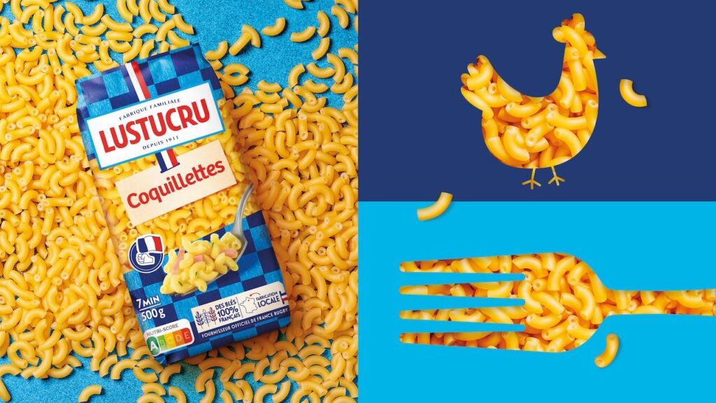
For generations, Lustucru has been instantly recognizable by its iconic blue checkerboard pattern—a design motif that has traveled across decades of advertising, family dinner tables, and supermarket shelves. The new packaging retains this emblematic pattern but frames it within a more contemporary visual language that places heritage and modernity side by side. At the center of this overhaul is a renewed commitment to emphasize the brand’s French roots, articulated through the “Origin’ Info” seal now prominently displayed on the pack. This seal serves as a pledge of transparency and traceability, reassuring consumers about where and how the products are made. It is also a symbolic answer to a competitive landscape in which provenance has become a crucial factor in purchasing decisions.
The pasta aisle is increasingly crowded, with gourmet Italian manufacturers using rich imagery—Tuscan landscapes, old-world typography, and region-specific recipes—to catch the attention of shoppers. Lustucru, rather than matching these aesthetic cues, is betting on its own story. The new packaging communicates pride in producing across France, investing locally, and maintaining the culinary traditions associated with French family meals. The choice to emphasize its roots is more than a branding exercise; it is a strategic move to carve out a distinct identity in a segment often dominated by Italian narratives.
One of the most striking features of the redesign is the use of a trompe-l’œil effect—an optical illusion that gives the pasta on the pack a more appetizing, lifelike appearance. This visual trick creates the impression of depth and realism, giving products a stronger presence on the shelf and making it easier for consumers to spot their preferred varieties. In an aisle where shoppers make decisions quickly, strong visual cues matter. The optical illusion aims to enhance recognition, spark appetite, and invite new consumers to engage with the range. It is also crafted without the use of plastic film, aligning squarely with Lustucru’s sustainability commitments.
The brand’s shift toward sustainable packaging began in 2022, when Lustucru made the move to recyclable paper for its Bonnes Pâtes françaises range. That decision, initially met with interest from both consumers and industry observers, has now evolved into something more refined and ambitious. The latest iteration of the packaging reaffirms that commitment, using only paper while managing to achieve a sophisticated and mouth-watering appearance often associated with laminated or plastic-coated surfaces. In doing so, Lustucru positions itself at the intersection of responsibility and desirability, proving that a sustainable pack does not need to compromise on visual appeal.
According to Lonsdale, finding this balance was one of the central creative challenges. Sandra Joly Guicheteau, Deputy Managing Director and Head of Consumer Branding at the agency, explained that every element had to work together to honor the essence of an iconic brand while aligning it with current market expectations. She noted that the redesign required reconciling three priorities—sustainability, appetite appeal, and impact—within a form that still felt unmistakably Lustucru. “For Lustucru, we created a design that’s indulgent, responsible, and powerful at shelf. Proof that a 100% paper pack can also be 100% desirable,” she said, emphasizing that the brand’s heritage was always treated as a central asset rather than a constraint.
The packaging system developed by Lonsdale spans the entire dry pasta range, creating consistency across formats and varieties. This coherence is meant not only to reinforce brand recognition but also to simplify at-shelf navigation. For many shoppers, the pasta aisle can feel overwhelming, with dozens of shapes and brands competing for attention. Lustucru’s more unified visual system gives consumers a reliable set of cues to identify and choose products more easily. The goal is clear: attract not just loyal customers but also those who often gravitate toward imported or artisan-style pasta brands.
At the heart of this refresh is a deeper awareness of evolving consumer priorities in France. Shoppers today are looking for transparency in sourcing, clarity in labeling, and reassurance that brands are committed to responsible production practices. Plastic-free packaging, renewable materials, and traceability markers have become defining factors for brands hoping to connect with younger and more environmentally conscious generations. Lustucru’s decision to foreground these values reflects an understanding that food purchasing is no longer just about taste—it is also about trust.
Sandrine Denoual, Sales & Marketing Director at Lustucru–Rivoire & Carret, part of the Pastacorp Group, said that this transformation had to remain faithful to what consumers have long loved about the brand. She emphasized the desire to unify responsible innovation with desirability on the shelf, framing the redesign as an effort to meet French expectations for quality, transparency, and visual delight without losing the brand’s sense of familiarity. The challenge, she noted, was to ensure that sustainability did not come at the expense of shelf impact or accessibility. “Our new Lustucru packaging—still plastic-free but now clearer and more mouth-watering—lets us meet French consumers’ expectations for quality and transparency. Our thanks to the Lonsdale teams, who supported us throughout this project while staying true to our popular, accessible, and committed DNA,” she said.
For Lustucru, the redesign is not only a packaging update but an articulation of long-term brand strategy. As consumer habits shift and global competition intensifies, heritage brands must find new ways to remain relevant without losing the identity that made them household names in the first place. The updated Lustucru packs attempt to do exactly that: retain the nostalgic warmth of a family brand while presenting a fresh, contemporary face that speaks to modern sensibilities.
The result is a packaging system that looks forward without letting go of the past. It signals that French heritage brands can innovate within their own cultural narrative rather than borrowing from others. By reaffirming its Frenchness, doubling down on traceability, and embracing sustainable materials, Lustucru is not just refreshing its look—it is reasserting its place in the hearts and shopping baskets of consumers who value tradition, responsibility, and great-tasting pasta.
Discover more from Creative Brands
Subscribe to get the latest posts sent to your email.


