
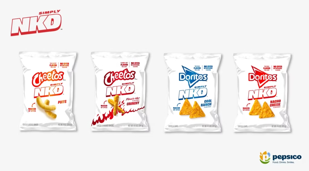
PepsiCo’s Simply NKD reinvents Doritos and Cheetos without artificial flavors or dyes, offering the same bold taste in a completely colorless form. Positioned as an additional option, not a replacement, NKD reflects clean-label trends and showcases PepsiCo’s commitment to purposeful innovation, flavor leadership, and expanding choices for modern snack lovers.
PepsiCo has long been known for pushing boundaries in the snack industry, but its latest launch—Simply NKD—feels like a genuine leap into the future. By reimagining the iconic Doritos and Cheetos brands without artificial flavors or dyes, the company has effectively challenged one of the most deeply embedded ideas in the snacking world: that flavor must look a certain way. With NKD, PepsiCo is offering the same bold, beloved taste of its flagship products, but in a completely colorless form. And the result is more than a reformulation—it’s a statement.
Simply NKD is not intended to replace the fluorescent-orange Cheetos or the fiery red Doritos fans have grown up with. Instead, PepsiCo positions NKD as an additive option, expanding choice rather than altering tradition. The iconic brands stay true to their identity and visual appeal, while NKD caters to evolving consumer expectations—particularly those seeking snacks with cleaner labels and fewer artificial additives. This dual strategy reflects PepsiCo’s attempt to embrace innovation without alienating loyalists, staying rooted in heritage while boldly experimenting with the next frontier of sensory experience.
One of the most striking aspects of NKD is its complete lack of color. For decades, color has been an essential part of the snacking experience. The neon dust on Cheetos fingers, the fiery hue of a spicy Dorito—these visuals have shaped perceptions of flavor intensity. Removing them is both a technical and psychological gamble.
PepsiCo frames this move as “innovation with purpose.” By stripping away artificial colors and flavors, the company aims to demonstrate that taste is not dependent on appearance. The challenge was not just in reformulation but in ensuring that consumers recognized the result as authentically Doritos or Cheetos, minus the typical bright coating. Achieving the same signature taste required careful calibration of ingredients to maintain the boldness and punch that fans expect from the brands.
The success of NKD will depend largely on how consumers respond to this shift. Yet PepsiCo seems confident. The company believes that taste leadership, not visual cues, will ultimately define snacking preferences in an era when transparency and simplicity in ingredients are becoming essential.
A product this unconventional demands an equally daring marketing approach. PepsiCo’s campaign for Simply NKD is described as unapologetically bold—playing on the tension between expectations and surprises. By spotlighting a snack that looks plain but hits with full flavor, the campaign disrupts common assumptions and invites curiosity.
The communication strategy leans into the “naked” metaphor, emphasizing purity, simplicity, and a stripped-down identity. The story isn’t about what was removed, but about what remains strong. PepsiCo wants consumers to realize that despite the absence of color, the product’s core essence—its taste—is untouched and as powerful as ever. It’s a message crafted to appeal not only to health-conscious buyers but also to trend-driven consumers who appreciate novelty.
Simply NKD arrives at a time when consumers are actively re-evaluating what goes into their food. The clean-label movement has gone mainstream. People want fewer artificial ingredients, more transparency, and products that reflect both health priorities and ethical choices. While PepsiCo has introduced many “better-for-you” options over the years, NKD represents a significant evolution because it touches two of its most recognizable, indulgent snack brands.
This move also underscores how big players in the food industry are adapting to modern demands without abandoning their legacy. Instead of reformulating core products—risking backlash from loyalists—PepsiCo is creating parallel options. NKD is about addition, not replacement, signaling that inclusivity in choice is the new competitive advantage.
One of the most interesting implications of NKD is how it challenges consumers to rethink sensory perception. Color has traditionally been used to create appetite appeal and indicate flavor. Removing it asks consumers to trust their taste buds more than their eyes—an unusual reversal in a world driven by visual marketing.
From a psychological standpoint, NKD forces a reorientation. For many, opening a bag of colorless Doritos or Cheetos may provoke curiosity, surprise, or even mild discomfort. But this is precisely what PepsiCo seems to be banking on: a memorable, conversation-worthy experience. The product stands out on shelves not because it is visually striking, but because it dares to be understated.
This counterintuitive approach aligns with a growing movement in food culture, where “minimalist” doesn’t mean boring. Just as packaging has shifted towards muted aesthetics and sustainability, NKD brings the logic of minimalism directly into the product itself.
Beyond consumer psychology, Simply NKD reflects a broader strategic intent: to reaffirm PepsiCo’s leadership in the global snack sector. Over decades, the company has built a reputation for bold flavors, memorable branding, and risk-taking. NKD adds another layer to this identity by showcasing innovation rooted in purpose.
PepsiCo is making a clear case that the future of snacking will not only be delicious but also more transparent, more flexible, and more aligned with diverse dietary expectations. The company appears eager to show that removing artificial elements does not dilute brand strength—it reinforces it. Taste, not color, becomes the hero.
This initiative may also influence trends across the industry. As a global leader, PepsiCo’s experiments often set precedents. If NKD gains traction, colorless versions of other popular snacks—across brands and categories—could follow.
The brilliance of Simply NKD lies in its balance. It does not attempt to rewrite the identity of iconic products; instead, it builds a new pathway alongside them. Consumers who love the classic fiery glow of Doritos or the signature orange mess of Cheetos can continue enjoying them exactly as they are. At the same time, those seeking a cleaner alternative now have an option that doesn’t compromise on taste.
This dual strategy may emerge as a blueprint for legacy food brands navigating modern expectations. Rather than forcing a single version of “healthier” or “cleaner” products, companies can diversify offerings to reflect varied lifestyles, values, and preferences.
Ultimately, Simply NKD is more than a reformulated snack—it’s a philosophical shift. It asks: What if flavor alone is strong enough to define a brand? What if minimalism can coexist with boldness? What if the future of snacking is not louder, brighter, or flashier—but clearer, simpler, and more intentional?
PepsiCo’s message is unmistakable: innovation doesn’t always mean adding more; sometimes, it means subtracting thoughtfully. NKD is bold in its simplicity, unexpected in its restraint, and game-changing in its challenge to visual norms.
If successful, it could spark a new design language for food—where purity becomes the standout feature, and taste proves its power without the need for anything extra.
In going colorless, PepsiCo may have created its most colorful idea yet.
Discover more from Creative Brands
Subscribe to get the latest posts sent to your email.


