
US-based illustrator Drew Bardana collaborated with Waitrose & Partners Weekend on a vibrant late-October double-page spread showcasing bold wine pairings for autumn comfort dishes. His graphic, colourful style brought warmth and clarity to the feature, turning food and wine into a visually rich, sensory celebration of the cozy season.
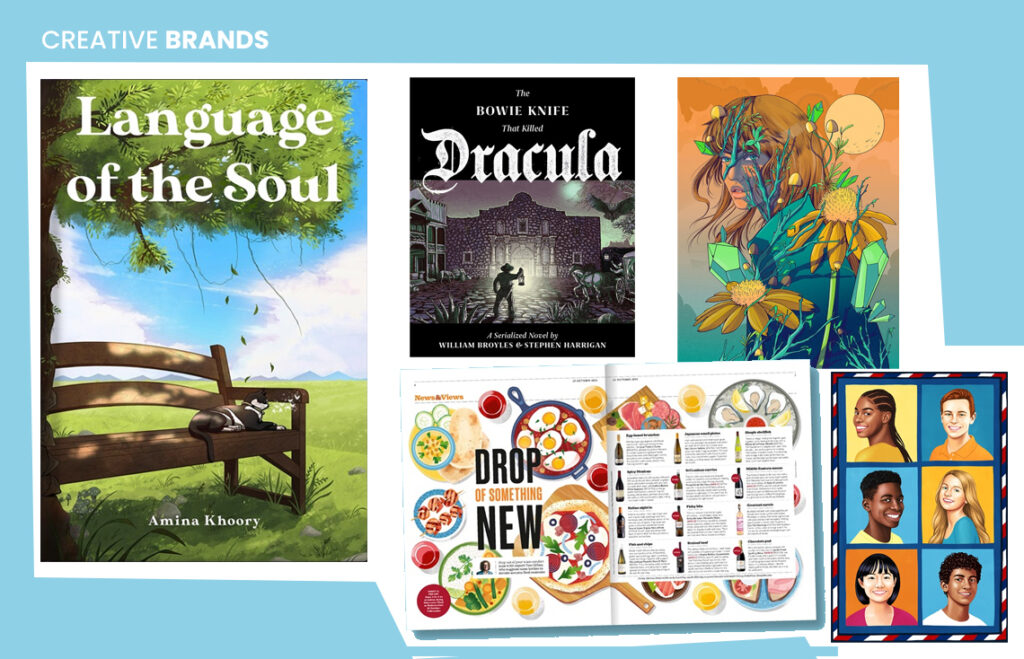
As the chill of autumn sets in, Waitrose & Partners Weekend has delivered a feast for the eyes — and the palate — through a vibrant new editorial collaboration with US-based illustrator Drew Bardana. The late October issue of the magazine features a stunning double-page spread that celebrates bold wine pairings for classic autumn comfort dishes, perfectly timed for the season of cozy indulgence.
The feature brings together two of autumn’s greatest pleasures — hearty seasonal food and rich, warming wines — and reimagines them through Bardana’s distinctive visual language. Known for his graphic style, crisp shapes, and lively colour palettes, Bardana infuses the spread with tactile warmth and playfulness. Each illustration radiates the flavour-forward spirit of the editorial, inviting readers to explore adventurous pairings without intimidation.
From roasted root vegetables paired with velvety reds to creamy pastas complemented by aromatic whites, every dish and drink pairing is rendered in bold forms and saturated hues that almost make the page itself glow.
“It’s a celebration of the comfort food season,” the magazine’s editors noted. “We wanted to inspire readers to explore new combinations — wines that surprise and dishes that delight — while wrapping the story in a sense of warmth and optimism.”
Bardana’s design approach strikes a rare balance between clarity and richness. His use of clean geometry and expressive texture turns food into a form of storytelling. In this feature, that storytelling becomes sensory — readers can almost feel the clink of glasses, the aroma of mulled spices, and the golden light of autumn evenings.
The layout maintains a fresh, editorial feel while embracing the mood of the season. Bold typography, dynamic composition, and Bardana’s signature use of tactile patterning give the spread an energy that’s both contemporary and comforting. It’s the kind of visual experience that invites a pause — an invitation to linger over the page as much as one might linger over a second glass of wine.
For Bardana, who has collaborated with international brands and publishers, this project is another example of how illustration can deepen the emotional appeal of editorial storytelling. His work often blends modern design sensibilities with human warmth — a quality that feels especially resonant in a feature about food, community, and comfort.
“Autumn food is about connection — with family, with flavour, with ritual,” Bardana said in a recent interview about his creative process. “I wanted the illustrations to feel like that — rich, textured, and full of life.”
That sense of connection shines through. Each element of the spread — from the swirling pours of wine to the layered textures of seasonal ingredients — conveys motion, taste, and togetherness.
Waitrose & Partners Weekend has long been known for its sophisticated approach to lifestyle storytelling, blending journalism, design, and culinary inspiration. This latest feature underscores the publication’s commitment to making everyday moments — like choosing a bottle of wine or cooking a weeknight meal — feel special.
In an age when digital media dominates, the print spread stands out for its tactile appeal. The interplay of Bardana’s illustration with thoughtful copy turns a simple concept — wine and food pairing — into a multisensory journey. It’s not just about what to drink or eat, but how to experience them together.
The double-page spread’s timing — appearing in the late October issue — couldn’t be better. As readers across the UK begin to swap summer salads for stews and set their tables for longer evenings, the feature offers inspiration that’s as visual as it is culinary.
The message is clear: great pairings are about creativity, not conformity. Whether it’s a bold Syrah matched with spiced pumpkin dishes or a chilled Chenin Blanc alongside a creamy mushroom risotto, the spread invites experimentation — and enjoyment.
At its heart, Bardana’s collaboration with Waitrose & Partners Weekend is a reminder that illustration remains one of the most powerful tools in editorial storytelling. It can make flavours visible, moods tangible, and ideas deliciously accessible.
Through this project, Bardana turns the idea of “wine and food pairing” into something bigger — a visual celebration of taste, texture, and the art of slowing down. The result is a double-page feast that captures autumn’s essence: warm, inviting, and full of flavour.
As readers flip through the issue, they’re greeted not only by culinary inspiration but also by the reminder that creativity — much like a good wine — is best enjoyed when shared.
Discover more from Creative Brands
Subscribe to get the latest posts sent to your email.


