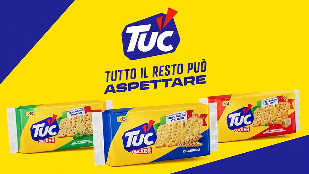
TUC has unveiled a striking European campaign that redefines its identity with new packaging, logo, and sonic branding. By celebrating everyday moments that often go unnoticed, the brand positions itself as a companion to life’s pauses. A recreated fairground carousel anchors the campaign, embodying vibrancy, immersion, and suspended joy.
In the world of fast-moving consumer goods, reinvention is often the difference between fading into the background and reclaiming cultural relevance. TUC, the iconic snack brand, has chosen the latter path, stepping back into the spotlight with a European campaign that is as ambitious as it is evocative. At its heart lies a simple but profound idea: what if the smallest moments became the biggest ones?
The campaign signals a turning point for TUC, not just in its visual identity but in its philosophy. With new packaging, a refreshed logo, and a sonic identity designed to resonate across markets, the brand is making a confident statement. This is not a tentative refresh but a bold rebrand, one that seeks to restore the full intensity of TUC’s presence in everyday life. The message is clear—small moments matter, and TUC wants to be the snack that makes them memorable.
The creative concept is rooted in the idea of suspended time. Those fleeting instants we often overlook—waiting in line, sharing a smile, taking a bite—are reframed as moments worth savoring. The campaign’s imagery captures this beautifully: ride operators at a fairground, so absorbed in their TUC crackers that they almost forget to watch the attraction. It is a playful exaggeration, but one that underscores the brand’s point. A bite of TUC can make the world pause, if only for a second.
To translate this philosophy into a tangible universe, the production teams embarked on an ambitious challenge. They recreated a full-scale fairground carousel inside a studio, a feat that required meticulous planning and execution. The result is an immersive, vibrant set that radiates spectacle and joy. The carousel is more than a backdrop; it is a metaphor for the campaign itself—circular, continuous, and filled with moments that spin by too quickly unless we choose to hold onto them.
The decision to anchor the campaign in such a vivid setting reflects TUC’s desire to connect emotionally with consumers. In an era where brands compete for attention in fragmented digital spaces, creating a physical, cinematic environment is a way to cut through the noise. The carousel embodies nostalgia and wonder, reminding audiences of childhood fairs and carefree laughter, while the act of snacking on TUC grounds the experience in the everyday. It is a clever juxtaposition: extraordinary staging for ordinary pleasures.
The rebrand also extends beyond visuals. The introduction of a new sonic identity signals TUC’s recognition of how sound shapes brand memory. In a world of podcasts, streaming platforms, and short-form video, audio branding is no longer optional. By crafting a distinctive sonic signature, TUC ensures that its presence lingers not just in sight but in sound, reinforcing its message across sensory touchpoints.
This campaign arrives at a time when consumers are increasingly drawn to authenticity and emotional resonance. The emphasis on small, unguarded moments taps into a universal truth: life is not only about milestones but about the pauses in between. TUC positions itself as the companion to those pauses, a snack that doesn’t demand attention but enhances it. In doing so, the brand aligns itself with a broader cultural shift toward mindfulness and savoring the present.
The imagery of ride operators distracted by their TUC crackers may be whimsical, but it captures a deeper insight into human behavior. Snacks are often consumed in transitional spaces—between tasks, during breaks, while waiting. By elevating these moments, TUC reframes its role from filler to facilitator of joy. It is a subtle but powerful repositioning, one that could resonate strongly with audiences seeking comfort in the everyday.
The campaign’s Parisian production adds another layer of significance. Paris, often seen as the capital of style and spectacle, provides the perfect backdrop for a brand seeking to reclaim its flair. The recreated carousel is not just a set but a symbol of TUC’s ambition to blend artistry with accessibility. It is a reminder that even mass-market brands can aspire to cultural impact when they invest in storytelling.
Ultimately, TUC’s rebrand is about intensity—bringing back the full force of what the brand stands for. The new packaging and logo modernize its look, the sonic identity expands its reach, and the campaign narrative deepens its emotional connection. Together, they form a cohesive strategy that positions TUC not just as a snack but as a cultural companion.
In a marketplace crowded with competitors, TUC’s decision to focus on small moments may prove to be its differentiator. By celebrating the pauses, the smiles, the bites, the brand invites consumers to see themselves in its story. And in doing so, it transforms the ordinary into the extraordinary. The carousel spins, the world waits, and TUC takes its place at the center of life’s suspended joys.
Discover more from Creative Brands
Subscribe to get the latest posts sent to your email.


