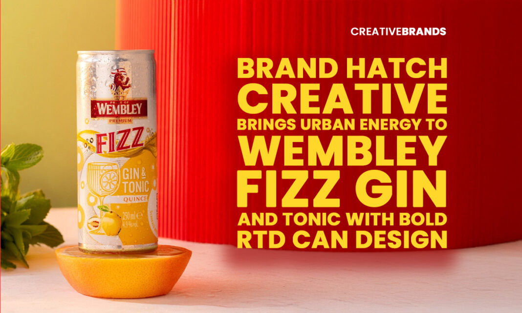
Brand Hatch Creative has unveiled a vibrant visual identity for Wembley Fizz Gin and Tonic, using expressive colours, fruit cues and bold graphics to signal flavour and freshness. The integration of exposed aluminium adds a premium, urban edge, creating a cohesive RTD range that stands out on the shelf and reflects contemporary drinking culture.
In a market where ready-to-drink beverages compete as fiercely on shelf as they do on taste, visual identity has become a decisive factor in how brands signal flavour, mood and modernity. Brand Hatch Creative’s launch of the Wembley Fizz Gin and Tonic range enters this crowded landscape with a confident visual language that prioritises vibrancy, clarity and contemporary appeal, positioning the product as both refreshing and unmistakably urban.
The Wembley Fizz cans are designed to communicate flavour before the first sip. Bold colour palettes, fruit cues and expressive graphic compositions dominate the surface, creating an immediate sensory association with brightness and juiciness. Rather than relying on subtlety, the designs lean into visual impact, reflecting the energy and sociability often associated with ready-to-drink gin and tonic. Each flavour is clearly differentiated through colour and illustration, ensuring quick recognition while still belonging to a cohesive brand family.
This balance between individuality and consistency is central to the brand system Brand Hatch Creative has developed. In a category where line extensions and flavour variants are common, maintaining coherence across a range can be challenging. Wembley Fizz addresses this by establishing strong underlying design principles — from typography to layout structure — that remain constant, while allowing colour and graphic elements to flex according to flavour. The result is a range that feels diverse yet unified, making it easier for consumers to navigate and for the brand to scale.
One of the most striking creative decisions in the Wembley Fizz identity is the deliberate use of exposed aluminium as part of the visual language. Rather than fully covering the can with ink, the designers allow sections of raw metal to remain visible, creating a contrast with the playful illustrations and saturated colours. This approach serves multiple purposes. Aesthetically, it introduces a premium, tactile quality that elevates the product above more heavily printed competitors. Conceptually, it reinforces a sense of freshness and honesty, aligning the physical material of the can with the drink’s crisp, refreshing proposition.
The exposed aluminium also adds a modern, industrial edge to the brand, grounding the vibrancy of the graphics in something more urban and contemporary. This interplay between raw and refined elements mirrors the dual appeal of gin and tonic itself — a drink rooted in tradition yet constantly reinterpreted for new audiences. By echoing that duality in the packaging, Wembley Fizz positions itself as both familiar and current.
Colour plays a central role in communicating the drink’s personality. The palettes chosen are bright and expressive, designed to suggest fruit-forward flavours and an easy-drinking experience. These colours are not merely decorative; they act as functional signifiers, helping consumers quickly identify their preferred variant. In a retail environment where attention spans are short, such clarity can be the difference between being noticed and being overlooked.
The graphic compositions further reinforce this sense of energy and playfulness. Illustrated elements and bold shapes create movement across the can’s surface, inviting the eye to explore. There is an intentional informality to the visuals, which aligns with the casual, social contexts in which RTD gin and tonics are typically consumed. At the same time, the precision of the execution — clean lines, controlled use of space, and a disciplined layout — ensures the brand does not slip into chaos.
Brand Hatch Creative’s work on Wembley Fizz reflects a broader shift in how RTD brands approach design. As the category matures, consumers are becoming more discerning, expecting products that feel thoughtfully crafted rather than opportunistic. Packaging is no longer just a container; it is a primary expression of brand values and quality. By investing in a distinctive, well-resolved visual identity, Wembley Fizz signals that it takes both flavour and presentation seriously.
The launch also highlights the increasing role of design studios in shaping brand narratives beyond traditional advertising. In many cases, especially for emerging or challenger brands, the can itself becomes the most important touchpoint. It must communicate flavour, quality and attitude in a matter of seconds. Brand Hatch Creative’s approach demonstrates how strategic design choices — such as material contrast and colour differentiation — can carry that narrative effectively.
Beyond its immediate commercial objectives, the Wembley Fizz project is also positioned within a wider creative ecosystem. The launch is being spotlighted through platforms that celebrate design excellence, with opportunities to enter the WBDS Awards and gain industry recognition, as well as to be featured across creative networks. This emphasis on visibility within the design community underscores the belief that packaging is not just functional, but a form of creative expression worthy of critique and celebration.
For the brand, such exposure can help build credibility and awareness, particularly in a crowded RTD market where differentiation is essential. For the studio, it reinforces a reputation for creating visually striking, strategically grounded work that resonates with contemporary audiences. The collaboration becomes a case study in how thoughtful design can elevate a product’s presence and perception.
Ultimately, the Wembley Fizz Gin and Tonic launch illustrates how visual identity can shape the way consumers experience a drink even before they open the can. Through a combination of vibrant colour, expressive graphics and the considered use of exposed aluminium, Brand Hatch Creative has crafted a brand system that feels fresh, modern and confident. It is a reminder that in today’s beverage landscape, refreshment is as much about what you see as what you taste.
Discover more from Creative Brands
Subscribe to get the latest posts sent to your email.


