

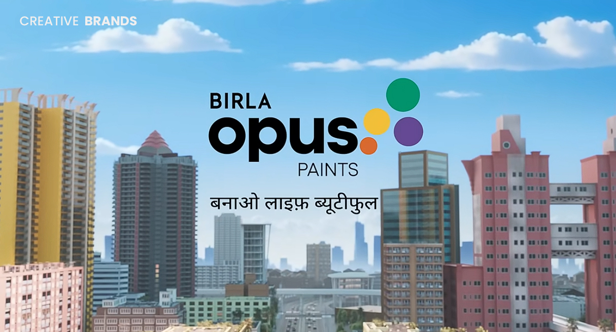
Birla Opus’ latest film spotlights modern families who sit together but scroll apart, positioning colour as the catalyst for warmth and real conversation. By transforming screens into mere backdrops and homes into vibrant shared spaces, the campaign makes a gentle case for how a splash of paint can help reconnect people.
In a world where families sit together but scroll apart, Birla Opus paints finds itself entering a cultural moment defined by dazzling screens, fragmented attention, and the quiet loneliness of hyper-connectivity. The brand’s latest film steps into this reality with a simple but resonant message: when conversation has stopped, perhaps colour can begin it again. In many homes today, the living room has transformed from a place of shared laughter into a silent gathering spot ruled by phones, tablets, and streaming platforms. Family members occupy the same space without truly inhabiting it together, their interactions distilled to brief glances or half-hearted comments. Birla Opus seizes on this shift not to lament it, but to reimagine the home as a canvas capable of influencing mood, emotion, and human connection through colour. The campaign’s premise rests on a striking inversion. Instead of treating technology as an intrusion into domestic life—an argument many brands have made—Birla Opus positions it as a backdrop. Screens still glow, notifications still ping, and gaming consoles still hum, but through the film, these familiar elements become secondary to something decidedly analogue: the warm earthiness of terracotta walls, the jubilant chaos of sunshine yellow, the serenity of pastel greens, and the contemplative richness of deep blues. Against these hues, the home stops feeling like a transit lounge and comes back to life as a shared space of conversation.
The narrative unfolds through scenes instantly recognisable to contemporary urban India: a teenager gaming with noise-cancelling headphones on, a mother scrolling through reels with an absent expression, grandparents glued to serials, siblings watching shorts without exchanging a word. Across these moments, Birla Opus paints suggests that digital coexistence has replaced emotional closeness. When colour enters the film, however, something subtle shifts. A fresh coat of paint begins to soften the rigid choreography of routine. The teenager removes his headphones to comment on how “cool” the new wall looks. The grandparents call the family to sit with them—not out of obligation, but to admire the hues. The mother looks up, genuinely engaged. That small conversation sparks another, then another, until suddenly the home feels louder, warmer, and unmistakably more connected.
This role of colour as both aesthetic tool and emotional conductor is not new to the world of branding, design, or even psychology, but Birla Opus frames it with a cultural specificity that resonates with Indian households. Colour has always occupied an important symbolic role in India’s festivals, traditions, textiles, and rituals. From the exuberance of Holi to the gravitas of deep maroons worn at weddings, colours are storytellers of mood, identity and social connection. The campaign nods to these cultural truths without leaning into nostalgia. Instead, it argues for colour as a modern instrument of connection: approachable, contemporary, and refreshingly free of the heavy-handedness that lifestyle advertising can sometimes slip into.
Part of the campaign’s efficacy lies in its refusal to moralise. Rather than scolding device use, it recognises it as a permanent fixture of family life. Screens aren’t going anywhere, the film seems to say, so the solution lies not in resisting technology but in rebalancing the home environment around something that invites shared experience. In this framing, paint doesn’t just change walls—it changes dynamics. The brand’s gentle tone is further amplified by its visual language. Cinematography steeped in natural lighting allows the colours to appear lived-in rather than staged, while the film’s pacing mirrors the slow process through which domestic closeness is rebuilt. The soundscape also plays a role: silence gradually gives way to overlapping voices, soft laughter and snippets of casual chatter, evoking the comfort of everyday intimacy rather than forced togetherness.
While many contemporary campaigns in the home décor and construction category revolve around durability, protection or aspirational luxury, Birla Opus takes a more humanistic route. Paint becomes an emotional proposition—one that speaks not to status but to atmosphere. At a time when consumers increasingly prioritise experiences over possessions, this positioning feels astute. Homes today must serve multiple identities: workspace, classroom, entertainment hub, relaxation zone, and social setting. The need to curate environments that support emotional well-being has only intensified in this multipurpose context. Birla Opus taps into this trend by articulating colour as a design choice that directly influences how we feel and how we relate to one another.
The campaign also arrives during a cultural conversation about loneliness, even within families. Studies in India and globally have noted rising feelings of isolation among all age groups, particularly teenagers and young adults, despite constant digital contact. The idea that connection requires intentionality—and sometimes something as simple as changing the surroundings—allows Birla Opus to ride a broader behavioural wave. In that sense, the brand is not merely selling paint, but entering the emotional economy that has increasingly defined lifestyle marketing in the past decade. It is a shift from product utility to human utility.
Of course, the commercial subtext remains clear. A home makeover is a tangible event, and paint brands have long understood that emotional triggers often drive renovation decisions. However, Birla Opus balances that commercial motivation with an unusually soft narrative touch. It does not ask the consumer to aspire upward; it asks them to look inward. It does not promise transformation through expenditure; it promises connection through environment. This makes the narrative feel more accessible and rooted rather than aspirational or elite.
While the film stands as the campaign’s centrepiece, marketing observers will likely note the potential for amplification through digital and social storytelling. Visual platforms are uniquely suited to colour-led campaigns, and user-generated content—showing real homes reinvented through paint—offers a pathway to continued engagement beyond the film’s initial release. Influencer partnerships, too, could play a strategic role, especially with home décor creators, psychologists discussing emotional design, or family-oriented lifestyle voices who can speak to the campaign’s broader theme of reconnection.
Ultimately, the campaign is best understood not as an indictment of technology, but as an invitation to reconsider how domestic spaces shape human interaction. In its world, togetherness is not restored through radical lifestyle change or digital detoxing, but through gentler interventions—like a splash of colour—that encourage curiosity, warmth, conversation and presence. Birla Opus offers a reminder that homes are not automatically places of connection; they become so through choices that foreground shared experience. In an age where relationships increasingly unfold across screens, the campaign’s message feels both contemporary and quietly hopeful.


Leave a comment