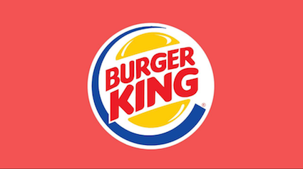
Burger King, an American multinational chain of hamburger fast food restaurants, headquartered in Miami-Dade County, Florida, has initiated a significant rebranding for the first time in over 20 years. It has redesigned its brand, including its logo, food packaging, and restaurants in order to reflect improvements. The new logo showcases the rounded font that mirrors the shape of its burgers and other menu items.
Speaking about the rebranding strategy, Fernando Machado, Global Chief Marketing Officer of Restaurant Brands International, which owns Burger King, said, “We’ve been doing a lot in terms of food quality and experience. We felt that putting a wrap around all that with an upgrade of our visual identity would help signal to our consumers that this is a brand that’s evolving.”


The company said, “Bold colours in shades of brown, red and green are a nod to Burger King’s flame grilling process and its use of fresh ingredients.” The company’s famously quirky and unique plastic-faced mascot — The King — will, however, stay despite the rebranding. “We love him the way he is, and he will continue to be weird,” Machado added.
The old burger logo, which was introduced in 1999, has been replaced by a more subdued, vintage-looking one. The branding will also be extended to Burger King’s food packaging, employee uniforms, and signage.
Burger King’s redesign couldn’t have come at a more appropriate time. Many major brands across the world are either flattening or simplifying their appearance to render it more functional, agile, and legible in the digital space. Lisa Smith, Executive Creative Director, Jones Knowles Ritchie, who worked closely with Rapha Abreu, Vice-President and Global Head of Design at Restaurant Brands International, attributes this functionality to the identity change. However, Burger King chose to keep its personality largely intact.


The new brand identity has been crafted to bring to the fore the message that the Burger King uses fresh ingredients, especially when the fast food industry has not been known to use healthy ingredients or promote healthy food. “We wanted to use design to close the gap between the negative perceptions people have of fast food and the positive reality of our food story by making the brand feel less synthetic, artificial, and cheap, and more real, crave-able, and tasty,” says Smith in a media interaction.


